2017 Interior Trends Follow-Up

Every year I relentlessly scour my favorite magazines, manufacturers and online resources for new introductions in search of the next years “Next Big Thing”. It is that time of year again when we take a look back at our Interior Design Trends to see how well we did with our 2017 predictions. Stay tuned for our 2018 Forecast coming in January!

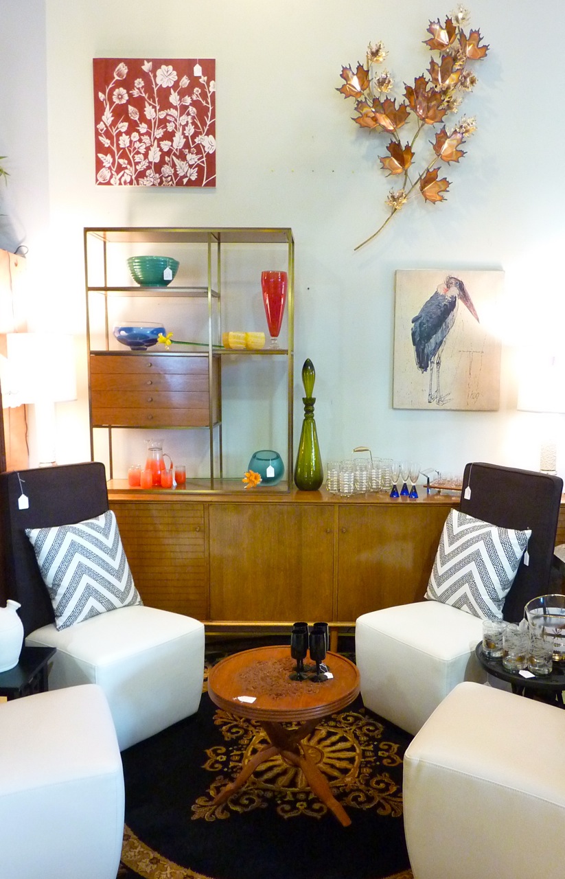
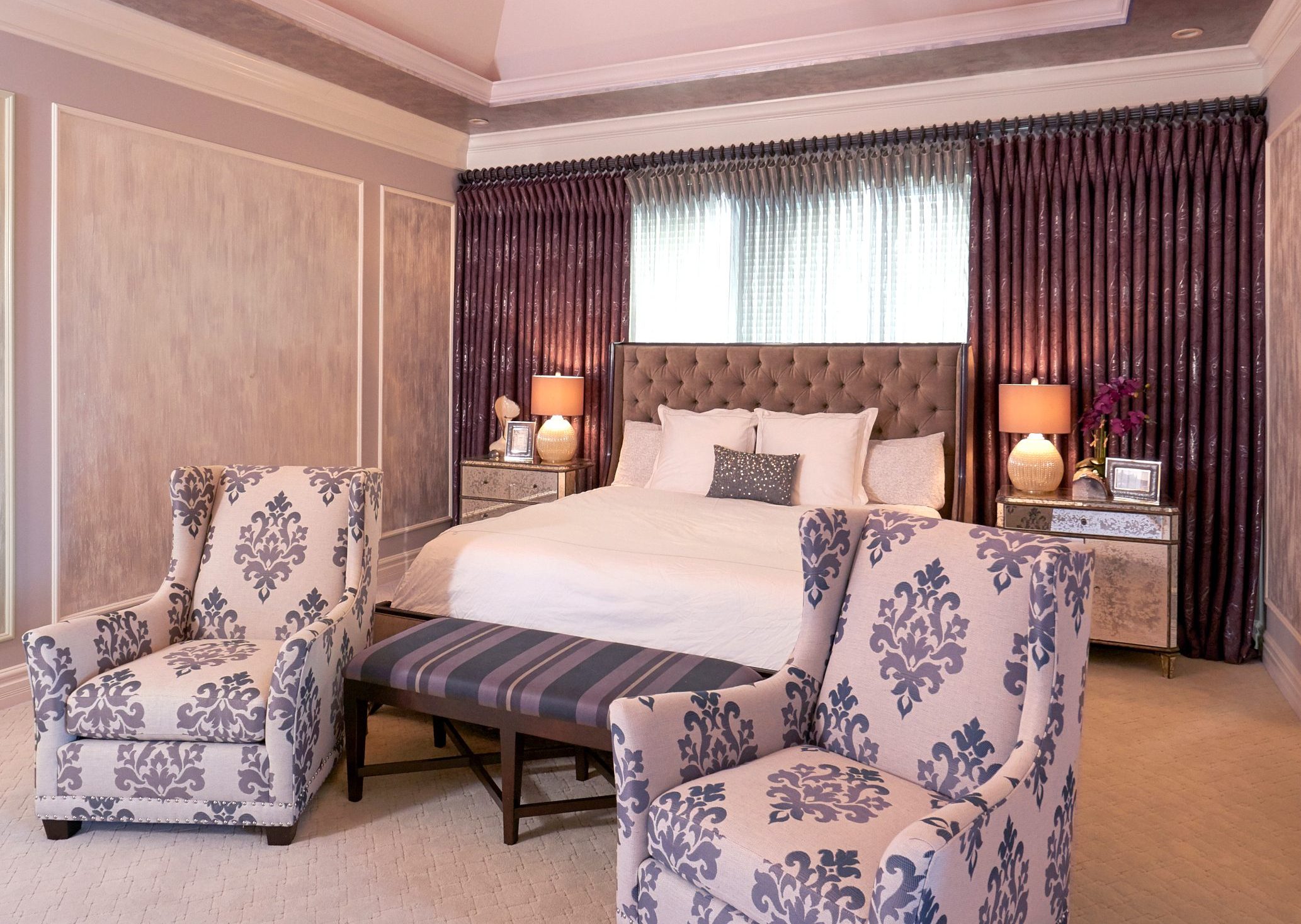
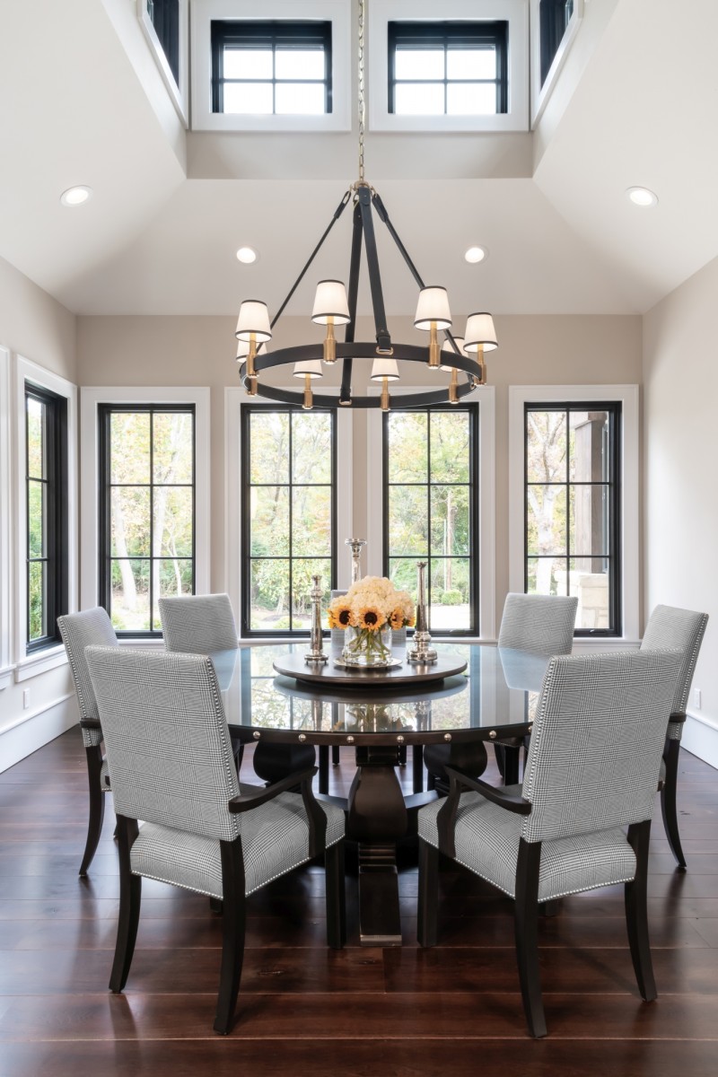
MIXING & MATCHING PATTERNS – While we did see mixing and matching it was mostly a textural difference than the bright, vibrant interiors featured below. As we continue to move through the gray and white craze we will certainly start to see some of these pops of colors making their way into our homes in 2018. HINT – Mixing and matching patterns becomes easier when anchored by a monochromatic or neutral backdrop.

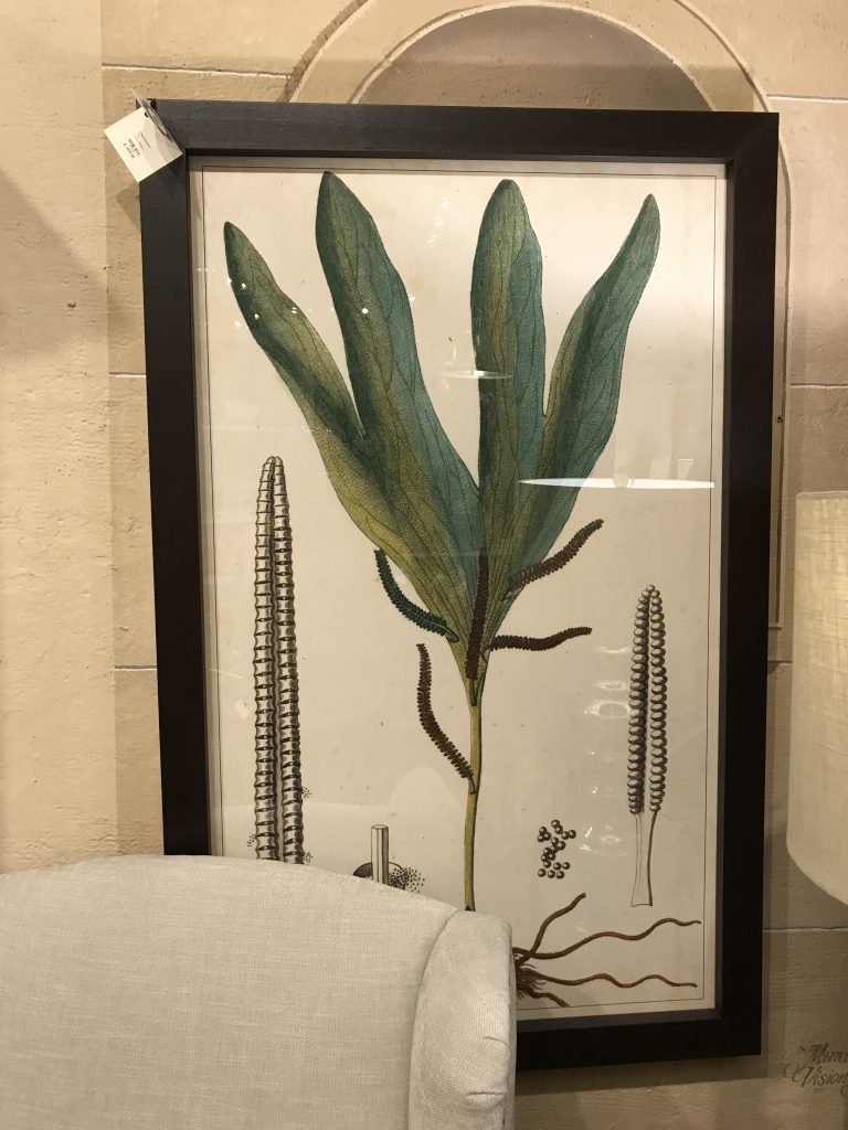
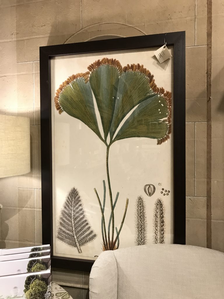
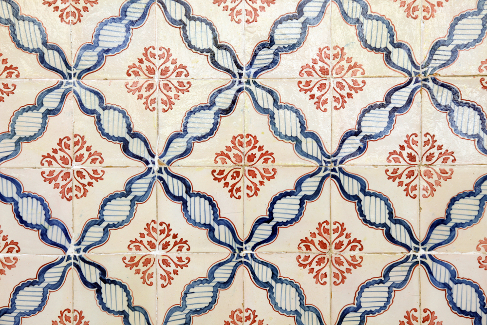
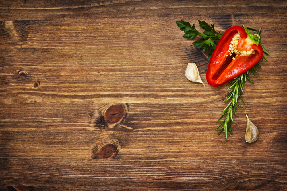
ART-INSPIRED WALLPAPER – I should have said ALL WALLPAPER! 2017 was the year of wallpaper at Schaub + Srote. Large scale prints, grasscloth, and metallic finishes/embellishments made their way into almost every one of our projects. If you haven’t considered using a wallpaper recently I encourage you to take a look. It seems we all have a wallpaper memory of our childhood. Mine happens to be of my kitchen covered in country blue bows with ducks(and matching canisters for the countertop). I promise you these are not the papers that haunt your past!

NAVY AND DARK GREEN INTERIORS – It would be an understatement to say that Navy was a HIT! I really hope that the Dark Green picks up in popularity as we make our way through 2018. Both work great as a neutral and create a drama that can’t be found in brighter tones of the same colors. Although these were not selected as the color of the year by the leading paint companies they will be EVERYWHERE!

DON’T SHOOT THE MESSENGER!

Here are a few of the design trends we will say goodbye to in 2017 –

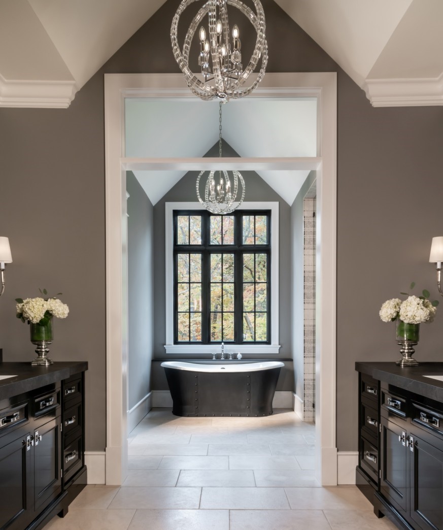
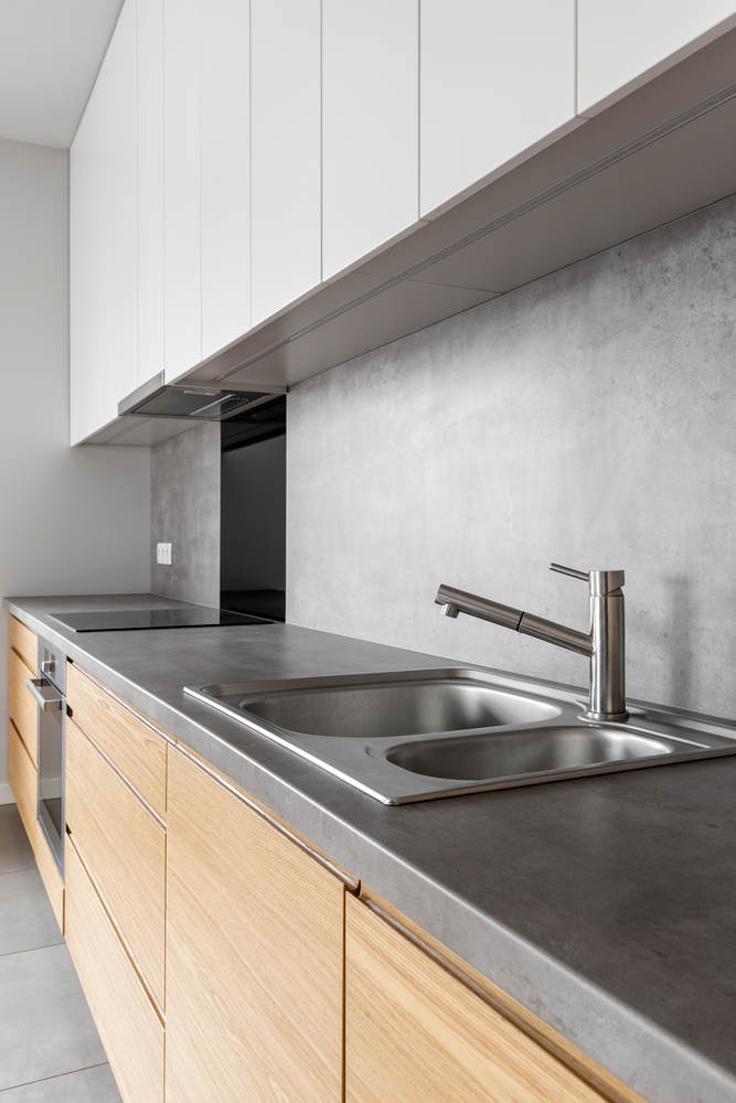
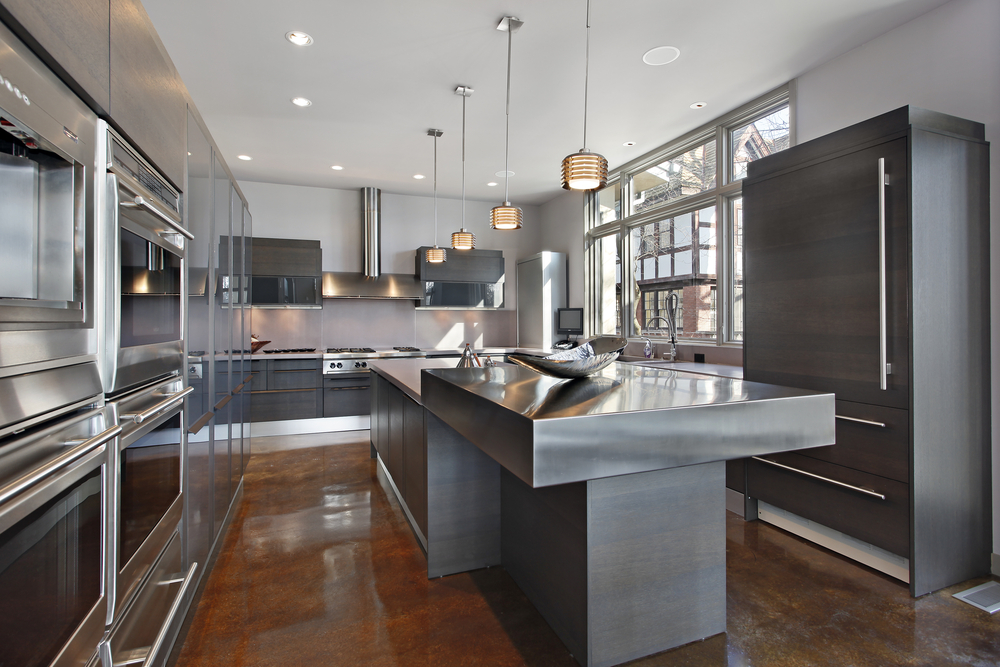
POLISHED METALS – So many amazing finishes were introduced to the market in 2017- all with a matte or brushed finish. Aged Pewter, Carbon, Architectural Bronze and Shadow are just a few that are featured in the new Waterworks catalog. Polished finishes haven’t completely disappeared they are just being layered with other finishes for visual interest.

“Warm metals like copper, brass and rose gold will continue to be on trend for autumn/winter 2016, but as we move into summer 2017 you’ll see a shift away from this super polished look,” says Diane Cocksey, Senior Interior Decorator at Freedom. “I expect you’ll see a more industrial aesthetic, with black steel and burnished metals taking over the home.”

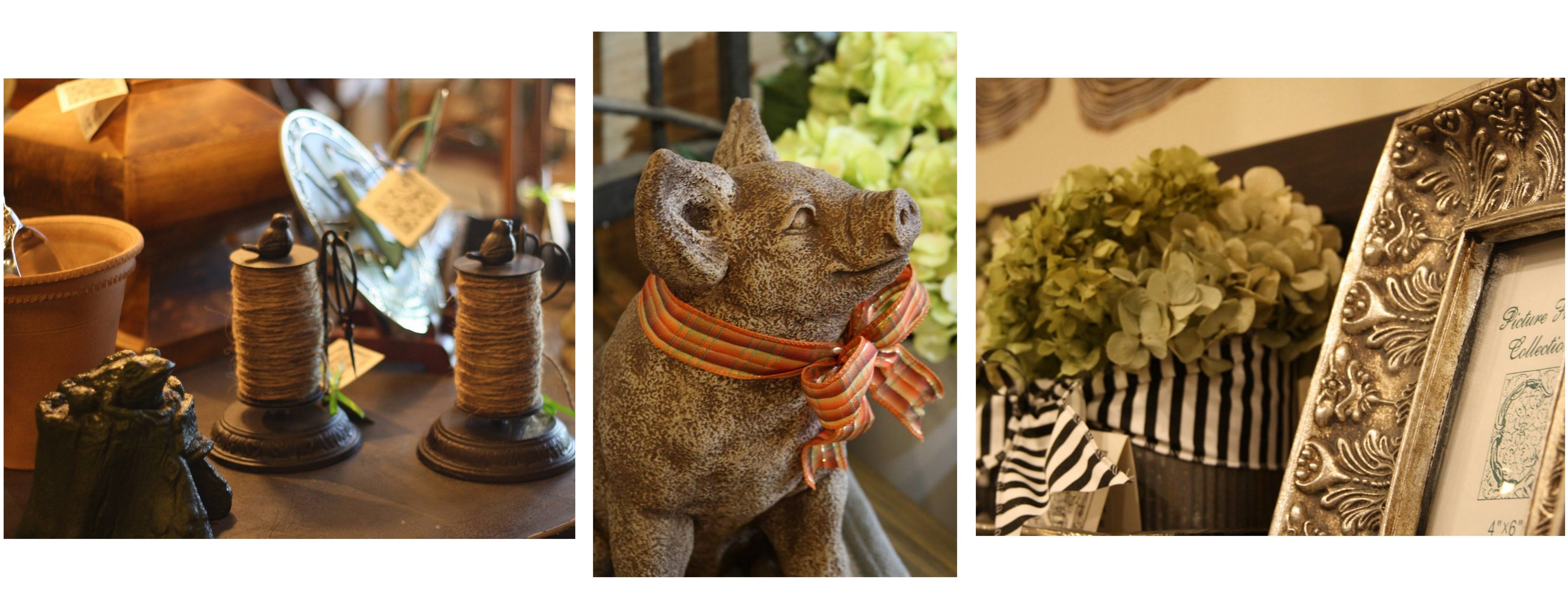
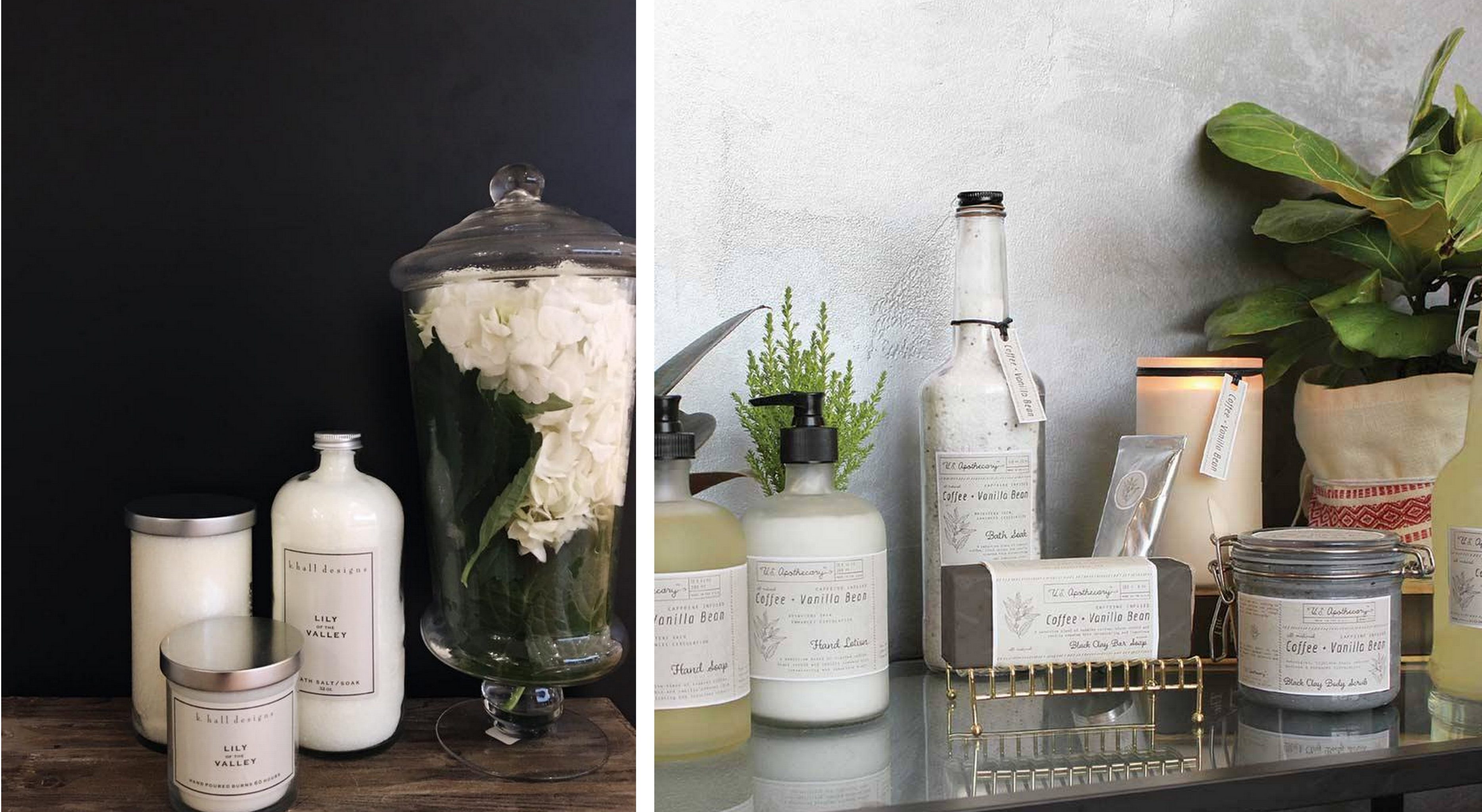
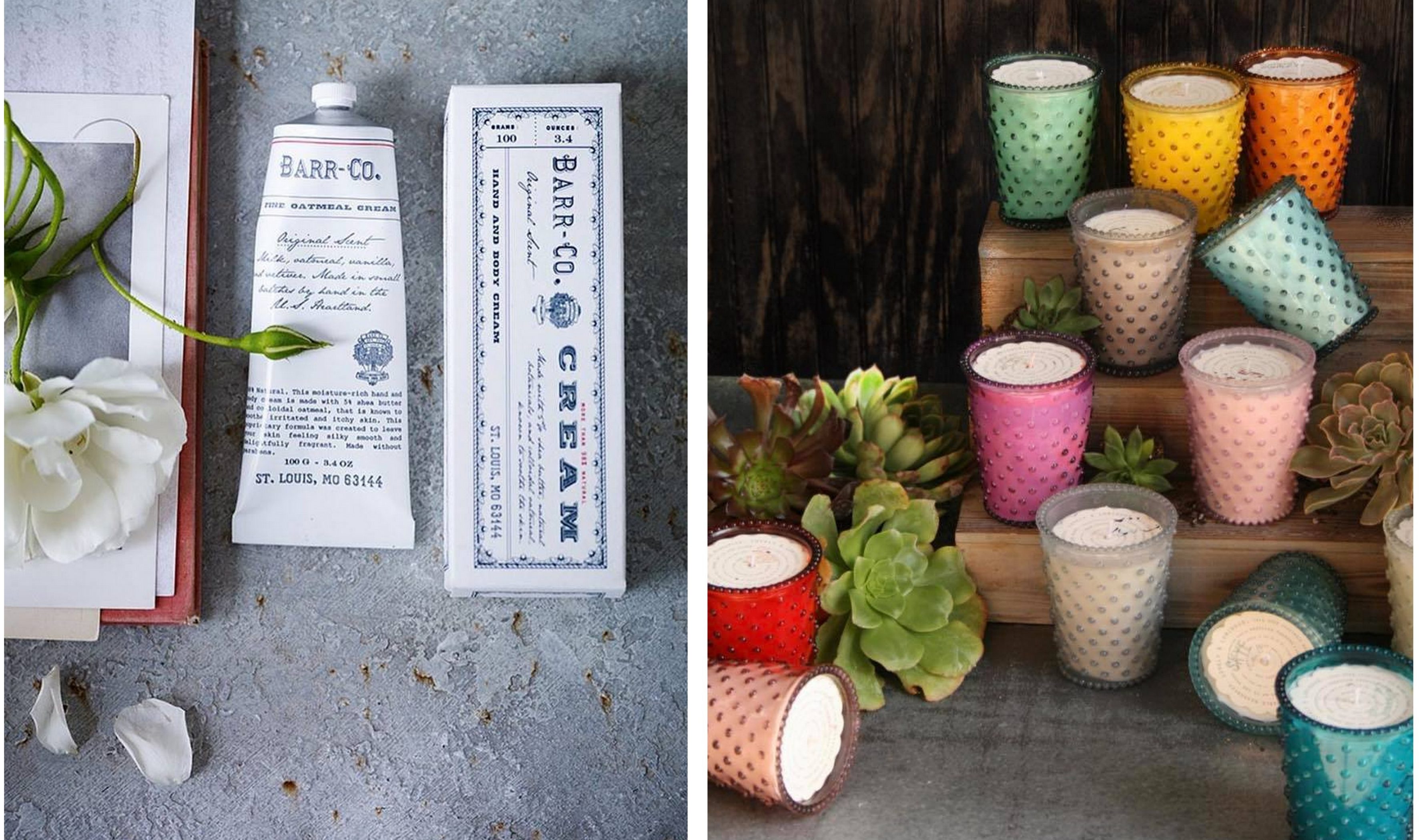
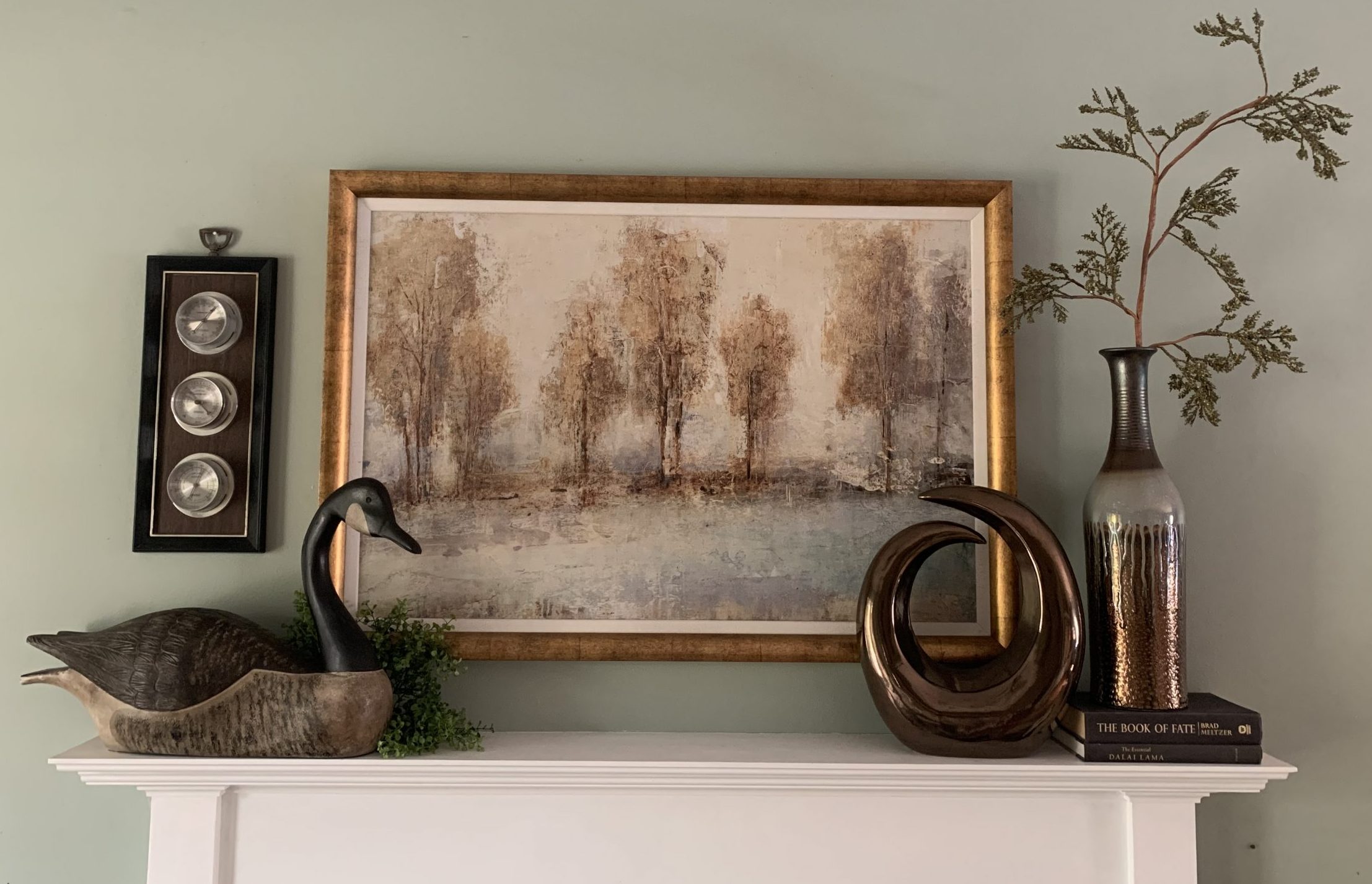
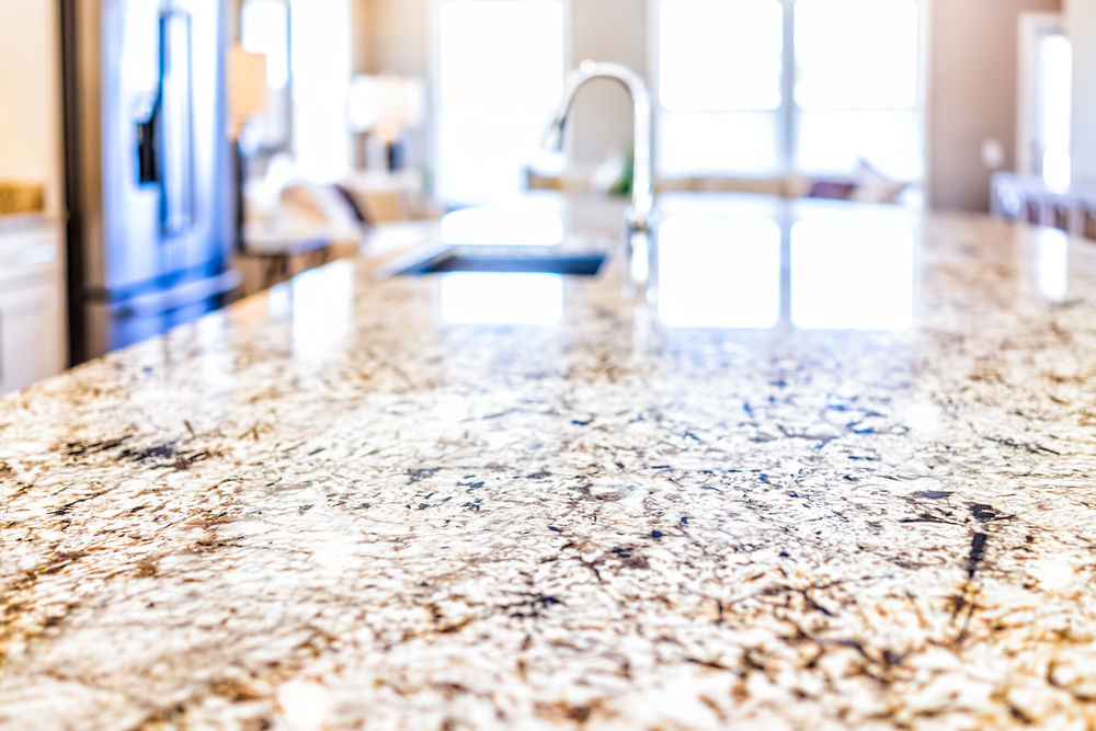
MARBLE HOUSEWARES – While I do not see the marble countertop trend coming to an end anytime soon, I think we have cycled through the marble-everywhere phase. I have to admit I am a sucker for a marble and wood serving platter or cutting board but I am ready for the next big thing in housewares. Stay tuned for our 2018 Trend Forecast to see what that will be.

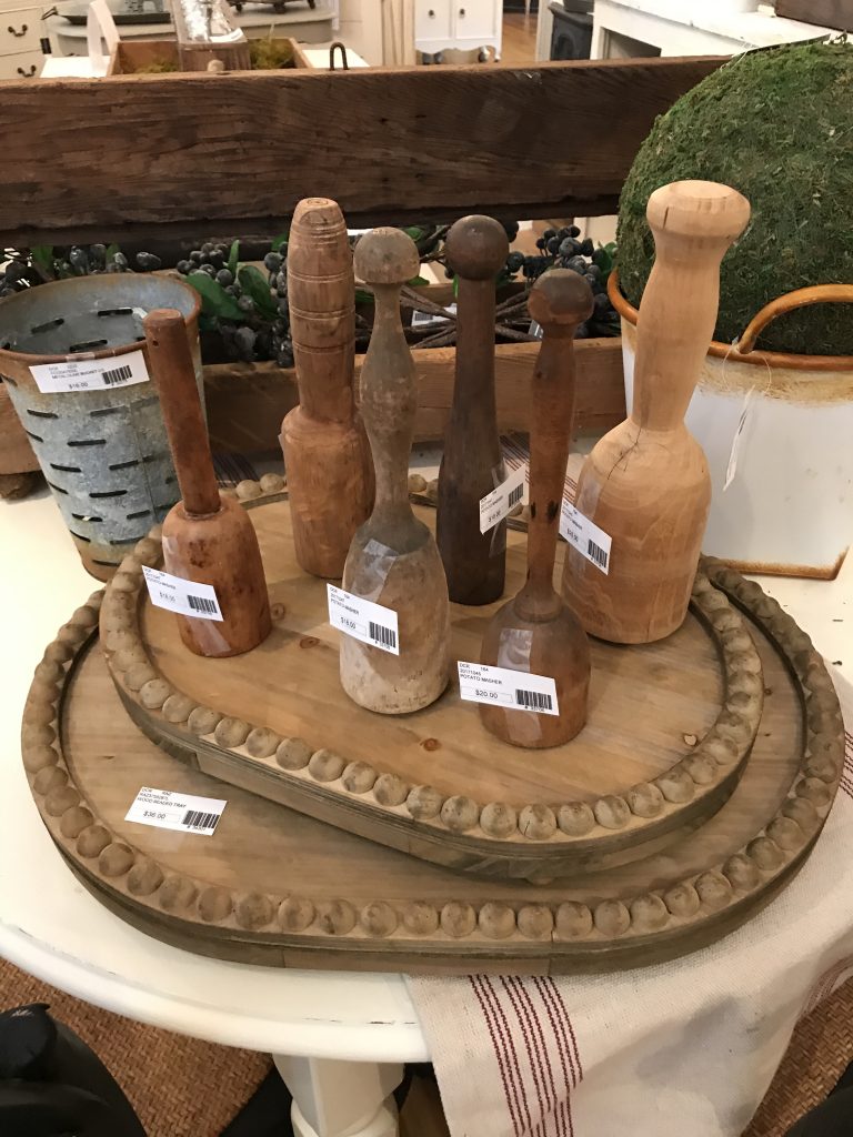
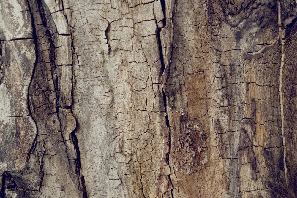
While marble is all the rage in the mass-produced homewares market, we can soon expect a sharp decline in interest. In 2017, be on the lookout for earthy textures like timber, clay and wicker to take its place.

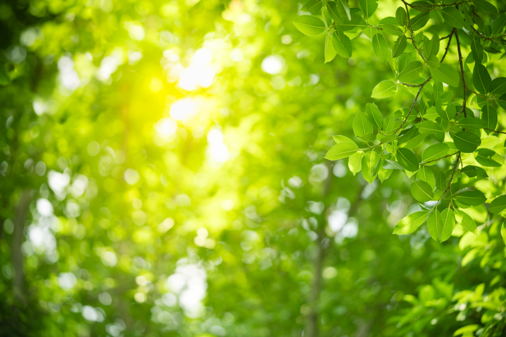
FIDDLE LEAF FIGS ARE OUT, OLIVE TREES ARE IN – The trend is certainly still leaning toward bringing the outside in. I  find the Fiddle Leaf Fig to be extremely popular and I happen to be a fan. Incorporating natural elements in your space is a designer must have. Just be sure to pick whatever reflects your style and fits the scale of your space. Those are the only rules.

I am struggling with this one! Fiddle Leaf Figs are EVERYWHERE. EVERY. WHERE. Cost, maintenance and lifespan are cited as the major factors for the decline in popularity.

How do you think we did on these predictions for 2017.

Which trends did you love or leave?

Any prediction for 2018?

Spotlight on Brentwood

While the exterior of our office at 2900 S. Brentwood Blvd is still under construction, the interior is finally starting to feel like home. In honor of our new location, today we turn our focus on a few of the amazing stores that we now share the 63144 zip code with.

  1. The White Rabbit

The White Rabbit is a mother-daughter owned boutique. The store offers unique gifts, home decor and accessories like old frames, whitewashed furniture, florals and sparkly chandeliers. They are animal lovers so don’t be surprised to see a furry family member when you visit.

Currently coveting:


THE WHITE RABBIT  |  9030 Manchester Road


2. The Refind Room

The Refind Room is an eclectic mix of vintage, modern, contemporary, mid-century furnishings. Each of their one-of-a-kind pieces is showcased in a designer inspired setting that is fresh, interesting and full of personality. If you love brands like Baker and Henredon or original mid-century art, you’ve found your home.

Currently coveting:


THE REFIND ROOM  |  2525 S. Brentwood Blvd


3. The Gifted Gardener

The Gifted Gardener is your entertaining HQ. They have gifts, decorative accessories, candles, pillows and more for every occasion and season. Garden accessories including statuary, urns, fountains, birdhouses, architectural remnants and more.

Currently coveting:


THE GIFTED GARDENER  |  8935 Manchester Road


4. K. Hall Designs

K. Hall Studio brings high quality and uniquely handcrafted home fragrance and personal care goods to the marketplace. This Midwest based company has expanded over recent years to include five brands and hundreds of products. Throughout its growth, K. Hall Studio has continuously maintained its core focus on producing the highest quality products with unique and appealing fragrance and timeless packaging.

Currently coveting:


K. HALL DESIGNS  |  8416 Manchester Road


Do you live or work in Brentwood? We would love to hear about your favorite places!

Mediterranean Tile

I was contacted by a local publication, St. Louis Homes & Lifestyles, to weigh in on their Classic vs. Craze section for an upcoming issue. The subject – “Mediterranean Tile in the Bathroom.” Do you see it as a timeless element or will it fade as quickly as it became a trend? For me it is definitely a “Classic”.

A BRIEF HISTORY

Mediterranean, or encaustic, tiles have been produced and used since the late 19th century throughout urbanized areas of the Mediterranean, using the same techniques invented by the Arabs over ten centuries ago. These tiles have truly stood the test of time. With today’s interiors trending towards white and grays I can certainly see why these tiles are making their way into our kitchens and baths.

Today’s Popularity

We are currently surrounded in white. White cabinets, white countertops, white shiplap, white trim….. Don’t get me wrong, I think that look is beautiful but not many of us live a lifestyle that affords us the time or energy to maintain that pristine look you saw on the cover of your favorite magazine. Using a tile with color and pattern make these spaces feel more inviting and livable. In kitchens and bathrooms in particular, we as designers are faced with the unique challenge of incorporating essentially all hard surfaces making the need for textural interest even more important.

THINGS TO CONSIDER

Even a classic element can be a trend! If you are considering these tiles due to the current exposure they are receiving on your favorite TV show or magazine, you may want to sit this one out. It is also important when selecting your tile that you are sticking with the style and architecture of the space you are using it in. If you decide to embrace this timeless element the possibilities are endless and the impact is undeniable.brightly colored and patterned Mediterranean tile hand-painted Mediterranean tile

Have you used this type of tile in any of your spaces? We would love to see your photos!

The Principles of Design – Unity & Harmony

Have you ever walked in a home where each room had its own color scheme or style? It can feel a bit overwhelming and disjointed. Many of my clients may not have a clear vision of what they want their space to look like they always tell me they want it to feel cohesive and inviting. With the direction in new construction over the last 10 years leaning towards large open spaces versus the separate, clearly defined rooms of the past, unity and harmony are move important than ever.

UNITY & HARMONY

Unity in design occurs when the elements in a space work together in such a way that the resulting look is balanced and harmonious. It is difficult to achieve unity without harmony.  Harmony is accomplished by the repetition of a particular design element, such as color, shape, texture, etc… that harmony is what creates the sense of unity. DIY’ers beware, too much unity in a room can lack personality and interest.

So what do unity & harmony look like in interior design?

bedroom with custom furnishings and drapery

Designed by Srote & Co

Using the same color in different intensities and items in a similar scale give this room a restful feel with visual interest.

Make sure to visit SroteCo.com to see how we incorporate unity and harmony everyday into our own projects.

The Principles of Design – Balance

Today we are kicking off a new blog series – The Principles of Design. This will explore the building blocks of great design with examples of how to achieve them in your home. Today we are going to explore the importance of balance.

BALANCE

Balance is a constant in our everyday lives. One of the most relatable examples is the ongoing struggle to balance life between work and leisure. Similar to when we are off balance in various aspects of our lives, an unbalanced interior space can be uncomfortable. Balance is achieved by distributing the visual weight of objects within a space to achieve a feeling of equilibrium.  The size, shape, color and texture have a major impact on the visual weight of a particular item. Larger, darker, brighter and highly textured objects typically feel heavier.

Balance can be achieved in three ways: symmetrically, asymmetrically and radially.

SYMMETRICAL BALANCE

Symmetrical balance is achieved by arranging elements on either side of the center of a composition in an equally weighted manner. Symmetrical balance can be thought of as 50/50 balance or like a mirror image.bathroom with symmetrical design

ASYMMETRICAL BALANCE

In asymmetrical balance, the two sides are not identical, but differ from one another. However, the elements are arranged so that there is a sense of balance.asymmetrical mantle accessories

RADIAL BALANCE

Radial balance is a visual balance based on a circle with its design extending from center.breakfast room radial balance

Make sure to visit SroteCo.com to see how we incorporate balance everyday into our own projects.

2017 Color of the Year Forecasts

What a difference a year makes! Every year the leading paint companies release their color trend predictions for the upcoming year. Last year we saw a white from both Benjamin Moore and Sherwin Williams, a blush pink and purple from Pantone and an aloe green from PPG. While none were exactly the same they all had a light fresh quality about them. This year, all bets are off!

PANTONE’S COLOR OF THE YEAR

REFRESHING. REVITALIZING. NEW BEGINNINGSlight shining through trees

Greenery is described as “a fresh and zesty yellow-green shade that evokes the first days of spring when nature’s greens revive, restore and renew.”

SHERWIN-WILLIAMS COLOR OF THE YEAR

MODERN. CLASSIC. NEUTRALwood bark on a tree

Poised Taupe is an earthen brown combined with conservative grey and the result is a weathered, woodsy and complex neutral that celebrates the imperfections and authenticity of a well-lived life.

BENJAMIN MOORE COLOR OF THE YEAR

MYSTERIOUS. PASSIONATE. ALLUSIVE.purple ink

Benjamin Moore Creative Director, Ellen O’Neill, described Shadow as sophisticated, provocative and poetic, it can bring energy to a space or harmony and a moment of respite.

PPG COLOR OF THE YEAR

DEPTH. LUXURY. PAMPERING.evening sunset

Violet Verbena is a moody purple with a chameleon-like presence that adapts to surrounding environments and complements a variety of design aesthetics, from playful rooms to tranquil spaces.

We would love to know you thoughts on the 2017 color forecasts. Which do you love? How will you use it?

For inspiration on how to incorporate these colors in your interiors check out our 2017 Color Trends Board on Pinterest.

2016 Trend Forecast Follow-Up

In January, I published a post – Top 5 Interior Design Trend’s In 2016 – for the Srote & Co Architects company blog. With this year almost behind us I thought it would be fun to take a look back at the trend forecast and see which ones made their way into our interiors and which ones I missed the mark on.

ECLECTIC INTERIORS

Eclectic design relies heavily on the building blocks of design (color, pattern, texture, and composition) to make a space look cohesive. People typically associate eclectic design with a chaotic mix of objects that all colliding in one space, so there is some hesitation in the design community to use this term when describing a desired aesthetic. This hesitation has brought about design styles such as Modern Farmhouse and Rustic Chic. While these classifications do describe the styles being combined, by definition, any time you combine more than one design style, it is eclectic.

UPDATE: Our interiors are as unique as we are. We will continue tailor the architectural and interior designs of our residences to match our personalities and lifestyles for years to come.

ARTISAN GOODS

Being socially and environmentally aware is no longer a trend, but a way of life. Fair Trade practice is an example of this growing awareness. This is a social movement with a goal to help developing countries achieve better trading conditions and promote sustainability. The items produced are specific to the region they are sourced from and handmade by local artisans. As an interior designer, I am always looking for one-of-a-kind items for my clients and have embraced this direction in design. Unique pieces from around the globe and locally sourced handmade items will be making their way into our homes in 2016.

UPDATE: This is definitely not a fad. Even retailers, such as Pottery Barn, highlight Fair Trade products on their websites today.

MIXING METALS

Metallics add warmth and richness to any space. The interior design trend is definitely leaning toward the warmer tones of copper, brass and rose gold. Silver, pewter and chrome are still in the mix, but are no longer the only metals in the room. This trend is about more than just mixing the metals; it’s about mixing their textures and sheens as well. These metals are no longer offered only in polished or brushed. Look for matte, burnished, antiqued and other designer finishes to be introduced to the market.

UPDATE: Metal did not perform as expected this year. While it was exciting to see the fun tabletop decor that first flooded the market, it didn’t really go anywhere from there.

NEUTRAL

Sherwin Williams and Benjamin Moore announced their “2016 Color of the Year”, and in stark contrast to last year’s selections, Coral Reef (SW) and Guilford Green (BM), this year, both selected a shade of white. These may seem like controversial selections from paint companies that, when combined, offer over 4500 paint colors. However, when you look at the entire color palette presented from both Benjamin Moore and Sherwin Williams you get a better grasp of the reasoning behind their selection. They are in no way suggesting we live in a white box. These colors merely serve as a backdrop to let certain features take center stage. Bold graphic designs, brightly accented walls surrounded by white trim and neutral backdrops highlighting the natural elements in a room are what this trend is about.

UPDATE: There is nothing stopping this train. Hang in there. This one is here to stay.

PATTERNS

With our walls taking on neutral tones, the opportunity to introduce visual interest will present itself in home accents. Bright graphic prints on accent pillows, area rugs and artwork is a great place to start. Geometric patterns are already saturating the market in wallpaper, flooring and backsplashes. Selecting the correct patterns and textures to accomplish your design goals can prove challenging and is best done in person if possible.

UPDATE: A swing and a miss on this one! Like metal it came on strong and then didn’t really have anywhere to go. Texture ruled over pattern and I think I see that trend continuing. But as well all know I have been wrong before, LOL!

Do you think I got it right or wrong?

Did you embrace any of these trends this year? We would love to see how you incorporated them into your decor.

Check back next month for our 2017 Interior Design Trend Forecast!

Home Sweet Home

As a designer I know the impact an environment can have on those living in it. So when I came across an article about Home Sweet Home, a St. Louis non-profit, in the Ladue News I knew I had to get involved. Next week many of us will gather around a table with family and friends and give thanks for the things in our lives that mean the most to us so I thought this would be an appropriate time to share the organization and my experience with you.

logo

ABOUT HOME SWEET HOME

Home Sweet Home is a local organization, based in midtown St. Louis, that works with case managers at partner agencies throughout the St. Louis region to provide clients access to new or gently-used furnishings and basic household items. The majority of the people they serve are veterans, those who are homeless, and survivors of domestic violence looking for a new start. This October they celebrated their first anniversary and in that short time they have served over 140 families in need in St Louis and St. Louis County.letter

“Just wanted to update you and your staff. And say thank you for all the work you do for us and the community. Home Sweet Home is a godsend and you and your staff are angels. My dad started to tear up when we brought the furniture in. In this day and time, when the world wants to take, I just want you to know that you guys gave me and my dad a home. Continued success and may God’s blessings continue for you and your families. This Marine is forever grateful. Semper Fi.”

HOW IT WORKS

Once referred by their case managers, clients are able to shop in their warehouse to select all of the furnishings and household items they will need for their new residence. All items are then packed, delivered and installed by Home Sweet Home volunteers. Their mission depends on furniture and household donations(they will come and pick up your items), volunteers(to help clients shop, pack, install, organize) and monetary donations.collage-1

“In order to effectively address homelessness in America and impact a long-term solution to this problem, people transitioning out of homelessness need help with stability. At Home Sweet Home, we believe part of that stability comes from establishing a first home stocked with the necessities for everyday life. Part of maintaining a home is usability and affordability. We can help make taking the first step to stable home life comfortable and accessible.”

MY EXPERIENCE

After reading the article and visiting their website, I contacted Betsy Reznicek, Executive Director at Home Sweet Home, to see how I could get involved.  On October 7th, I got the call! The client was a military veteran with a 4 year old daughter. Due to her work schedule and relying on public transportation she would be unable to come in and select her items. I was asked to come in and make the selections on her behalf then participate in the delivery and installation. Making the selections at the warehouse was an eye opening experience. While some of the clients they serve are in need of a few items this family was literally starting from scratch. When we arrived at the apartment for the install, it was completely empty except for a sleeping bag on the floor that the mom and daughter had been sleeping in together. That day we set up beds with linens and pillows, stocked the cabinets with plates, cups, and utensils, and arranged a small sitting and eating area. It doesn’t seem like much but to this family it was everything.12510406_485528648301571_1819704498813117248_n

I can tell you the entire process of loading the furniture at the warehouse to completing the install took no more than 2 hours. I can not tell you how many times the mom thanked and hugged each of us nor can I adequately express the emotions I experienced seeing her daughter jump into her very own bed with a pillow. I volunteered to make a difference in someone else’s life. I never expected the experience to make such a difference in mine.


If you are interested in learning more about Home Sweet Home, their volunteer opportunities and upcoming events, please visit their website or Facebook page.

14522780_589338564587245_1469390460568519746_n


Sherwin Williams 2017 Color Forecast

Every year I look forward to Sherwin-Williams ColorMix, hosted in St. Louis, at KDR Designer Showroom. This event is the official unveiling of the projected color trends for the upcoming year. I was so inspired by the presentation I thought it would be fun to share the 4 palettes with you.

NOIR

It’s among our most precious commodities: night. We’re craving a refuge from urban streetlights and glowing screens, space to turn our gaze inward and recharge the spirit. Mindful melancholy is fueling a new romanticism marked by medieval patterns, revived customs and bittersweet beauty. The Dutch masters knew the secret: dark hues set a dramatic stage for sensuous luster. This palette is rich with vine-ripened fruits, Nordic blues, moody neutrals and golden yellows.

HOLISTIC

Sustainable design and radical transparency are the new standards. As our daily transactions move further into the cloud, acquiring experiences is becoming preferable to buying more things. “Doing good” is the new looking good, and it’s taking the form of “voluntourism,” healing retreats and eco-travel. We’re in pursuit of an elusive ideal: a fair luxury. The roads of this journey are lined with arctic neutrals, blush rose and wild browns.

INTREPID

The virtual and the real are blurring in the form of seamless commerce and “office anywhere” collaboration. Impatient for social and political change, we’re reinventing ourselves first. Identity has never been more fluid. “You do you” is the mantra of a generation primed for self-expression, cheered on by their own #squad and tossing aside old categories. There’s a feisty energy to our present moment, arriving in fiery tones and vibrant, kimono colors.

UNBOUNDED

Global immigration is redefining borderlands, national identity and our sense of coexistence. We’re all citizens of the world now. Brands are becoming more purpose-driven, communities more connected. Design is adapting to more diverse populations. Overconsumption is, well, over. We’re more likely to invest in the best we can afford — crafted and customized — and then keep it forever. Global consciousness is a mural painted in earthy mustards, ocean blues, corals and mud.

Visit Srote & Co on Pinterest to view our boards dedicated to each palette.

Choosing The Right Countertop

Selecting the correct countertop material is one of the most important decisions in your kitchen or bath project. With so many materials available today it can be overwhelming when it comes time to make this selection. In today’s post we explore some of the most commonly used materials and the expectations associated with them.

GRANITE

Granite is, by far, the most popular material specified in kitchen and bath remodels.  It is a strong, durable and long lasting material. Granite is scratch-resistant, and when sealed, impervious to stain, heat and water.  Slabs are available in a wide variety of colors and patterns. Granite requires sealing at the time of installation and over the life of the material, typically once a year.granite countertop close-up

QUARTZ

Quartz countertops are a man-made product consisting of almost 90% quartz, making it an extremely durable non-porous material perfect for kitchens and bathrooms.  It does not require sealing, will not chip or crack and is stain and bacteria resistant. Quartz is available in wide variety of colors and patterns. In general, it is more expensive and not as heat tolerant as granite. quartz kitchen counter

QUARTZITE

Quartzite is sandstone that has been subjected to heat and pressure due to tectonic compression. This resulting material is hard, dense and extremely resistant to abrasion and chemicals. Quartzite, like granite, does require sealing at the time of install and over the life of the material, typically once a year. This hard working material comes in a wide variety of colors and patterns and is idea for kitchens and bathrooms.quartzite counter

MARBLE

Marble is a relatively hard material composed mostly of calcite. It is highly resistant to heat, cracks and breakage, however, marble is very porous and susceptible to staining and etching.  Marble is best used in areas where it will not be exposed to chemicals, citric or acidic substances. Even with the use of a sealer, clean-ups should be handled immediately. If you are in the market for a kitchen countertop and want the look of marble I suggest looking at a quartz or quartzite product that will give you look of marble and the performance of a granite without the maintenance and upkeep.marble bath vanity top

WOOD COUNTERTOPS

Appearance is the number one reason people select wood for their countertops. It adds natural beauty and warmth to any kitchen and works well with several design styles. There is considerable maintenance required to keep your wood tops looking like new. Proper sealing is a must to ensure a non-porous surface and protect the tops from water damage. Wood is much softer than other materials typically used in a kitchen so scratches and dents are inevitable. Additionally, your wood top may require sanding and refinishing over it’s lifetime depending on use.

CONCRETE COUNTERTOPS

Concrete countertops offer a wide range or colors and finishes and are lightweight and durable. Concrete is naturally very heat resistant but also porous so a sealer is a must. The use of a sealer on your tops may cause discoloration if hot pans or pots are placed directly on the surface. Imperfections in the surface are a common occurrence due to the molding process and after time hairline fractures may occur. Concrete is gaining popularity in modern and rustic designs and works well in kitchens and bathrooms when properly maintained.modern kitchen with concrete countertop

STAINLESS STEEL

Stainless is already the go-to countertop material in most restaurants. And for good reason – they perform amazing! They are non-porous, resistant to water, heat, stains, mold, bacteria and other household germs. Additionally, you can place hot pots and pans directly on top them with no worries. However, stainless countertops will scratch and dent and tend to show smudge marks and fingerprints. If you can live with that they are suitable in any application.modern kitchen with stainless steel counters