Saint Louis Artist – Chad M. Lawson

pink

black-white-and-gold


GET FAMILIAR

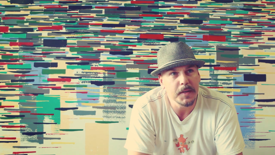
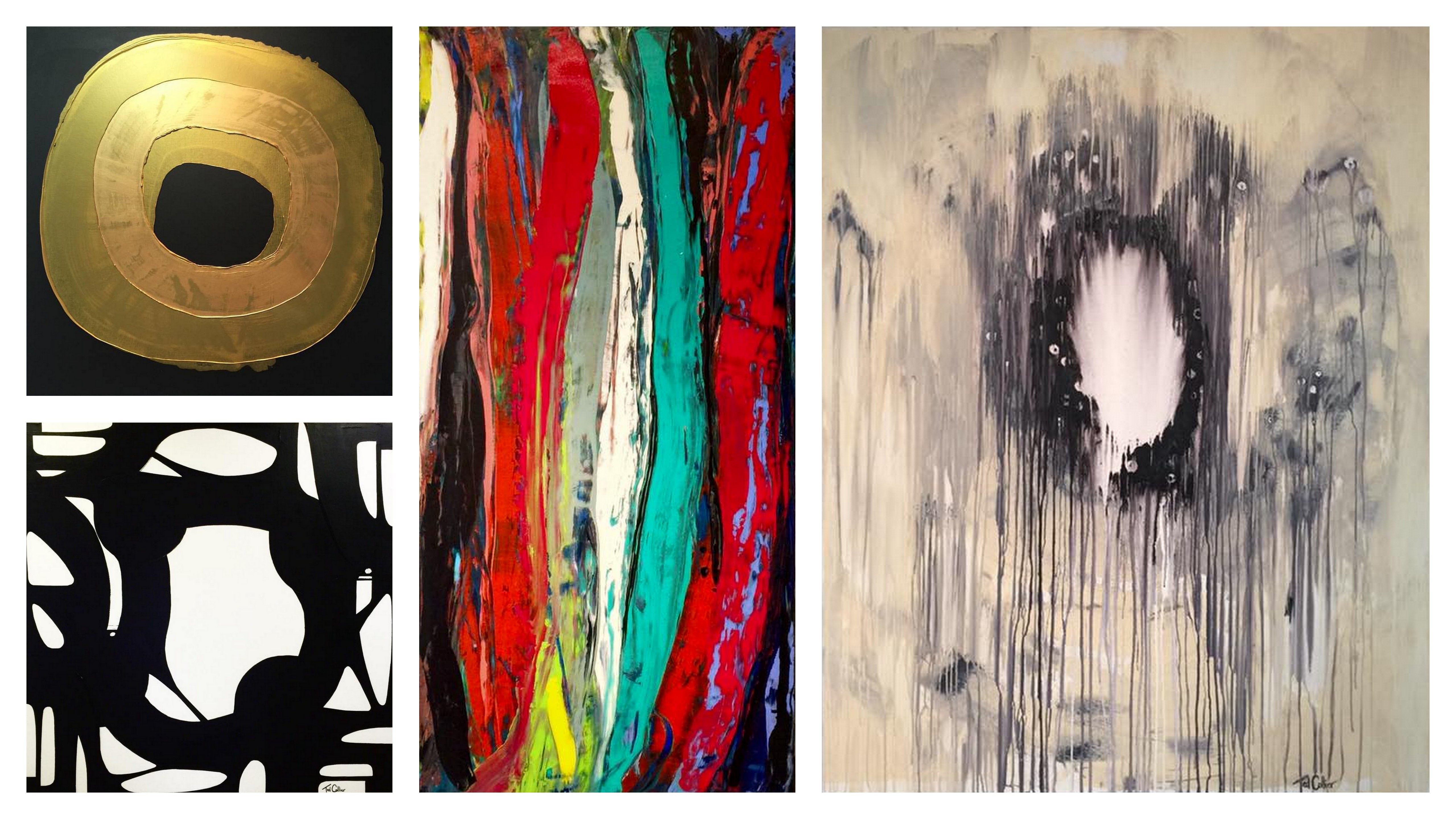
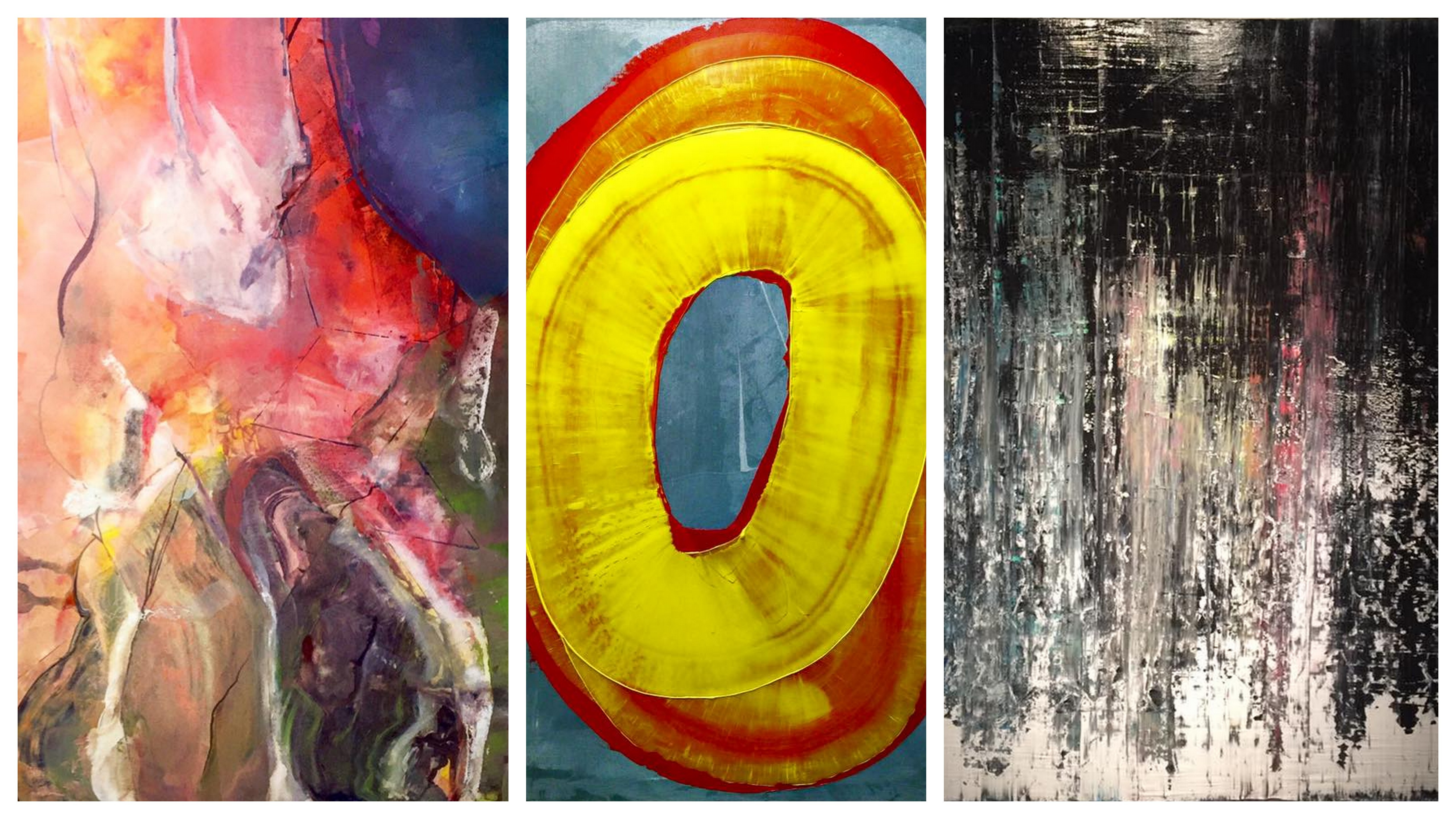
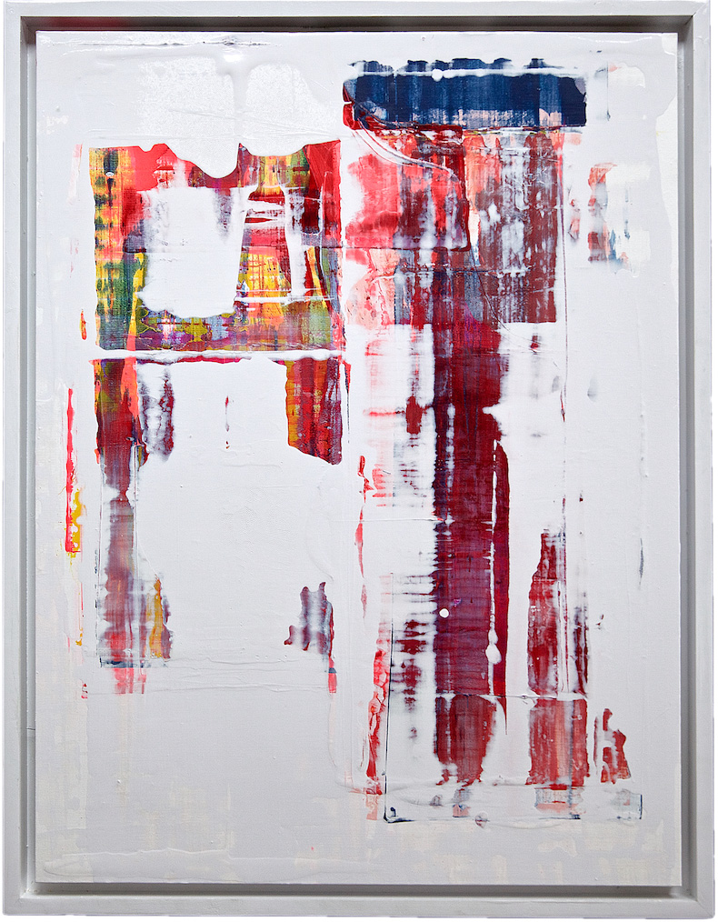
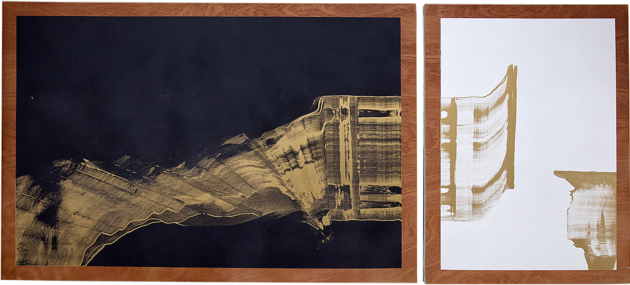
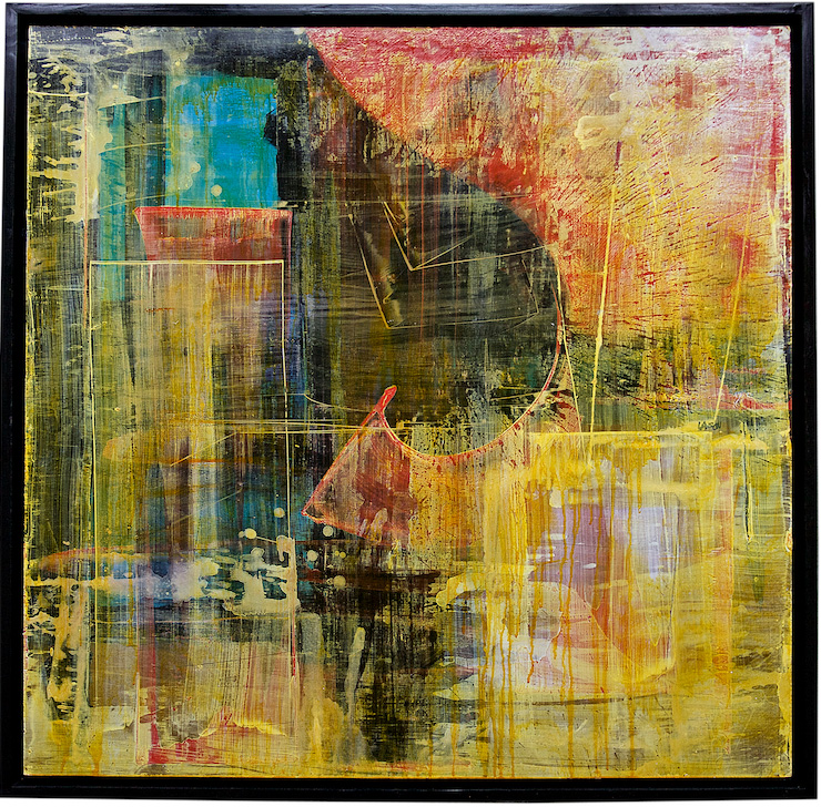
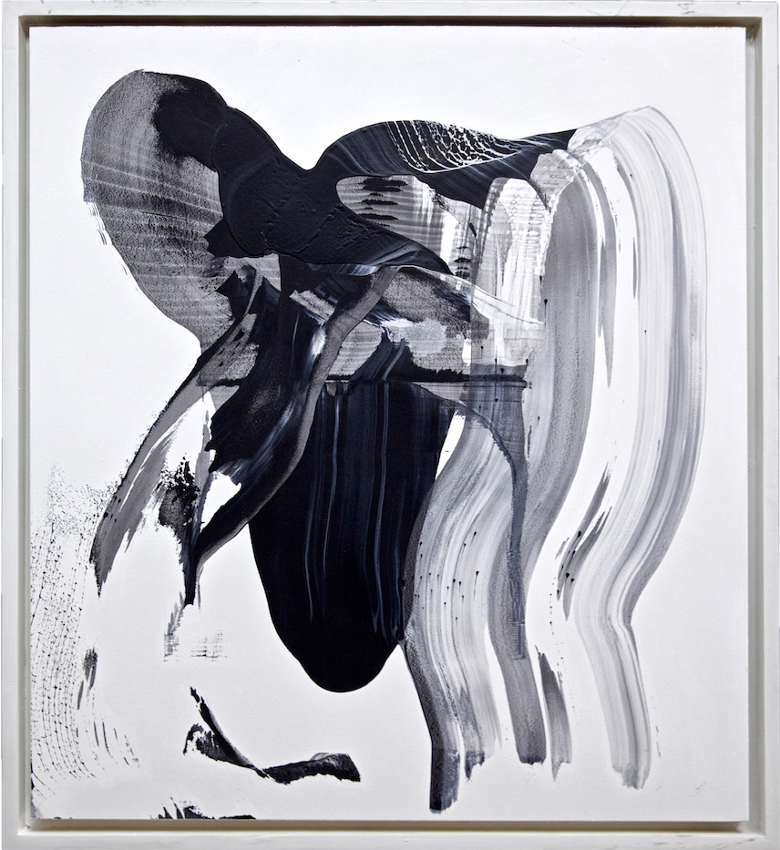
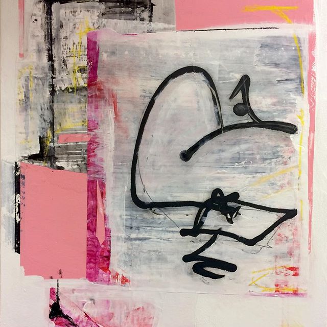
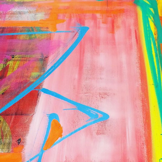
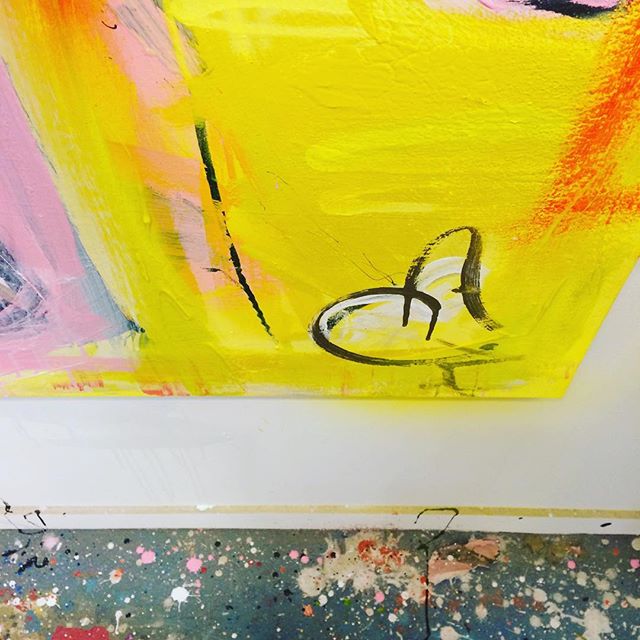
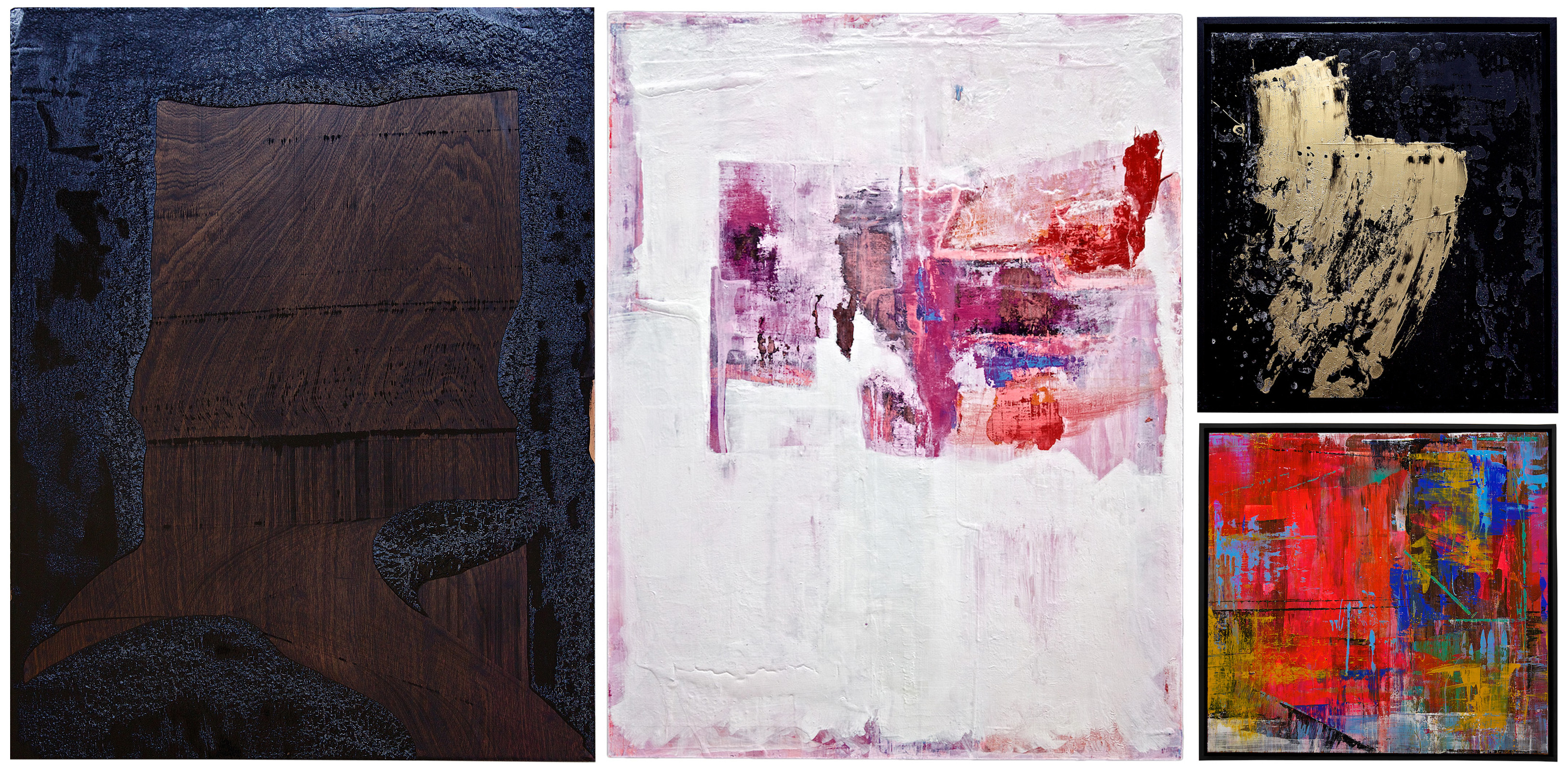
Chad M. Lawson is a true creative soul living and working in downtown St. Louis! Chad is best known for his beautiful abstracts done on salvaged wood doors and his mixing of oils and acrylics to create unique textures and movement. Painting on a hard wood surface can pose quite a challenge but he has mastered the skills to do so. Each piece of art is striking, layered, and begs the viewer to take a closer look!

yellow

black-and-white


BE INSPIRED

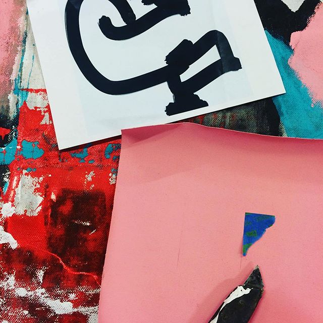
Chad finds inspiration in literature and music. Part of his process is to work on a few pieces at a time while listening to a specific musical artist or genre. The type of music influences the intensity of each stroke. One day he might add strong graffiti-like elements while listening to hip-hop and the next day add precise, delicate lines while listening to his favorite cellist.

sankofabird

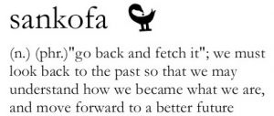
The sankofa symbol is another important element of his work. Based on a mythical bird with its feet firmly planted forward and its head turned backwards, sankofa signifies the wisdom in learning from the past to ensure a strong future. You can see elements of this symbol in several of his works (see below)!


SHOW ME MORE

Want to see more?! Chad currently has pieces on display at the Cortex as well as Whitebox Eatery! Be sure to visit his website to see more of his amazing creations.

collage

Chad is currently working on a collection investigating the journey and challenges within the adoption and adoptee narrative.  The collection features the adding and subtracting of layers, movement, and color in the search for identity, be it past or present. This work will be revealed at his February 2017 show.

Chad is also writing a book on growth for both ones art and building lasting relationships with clients. He draws on his over twenty years of curating his own work and others, with what would these days be called “pop-up” shows. Chad started doing this in the mid 1990’s in Miami, then St. Louis, and San Francisco. The book will also contain advice and questions for both new and established artists to help them better structure their time, finances, and resources. Be on the lookout for it early next year!

studio

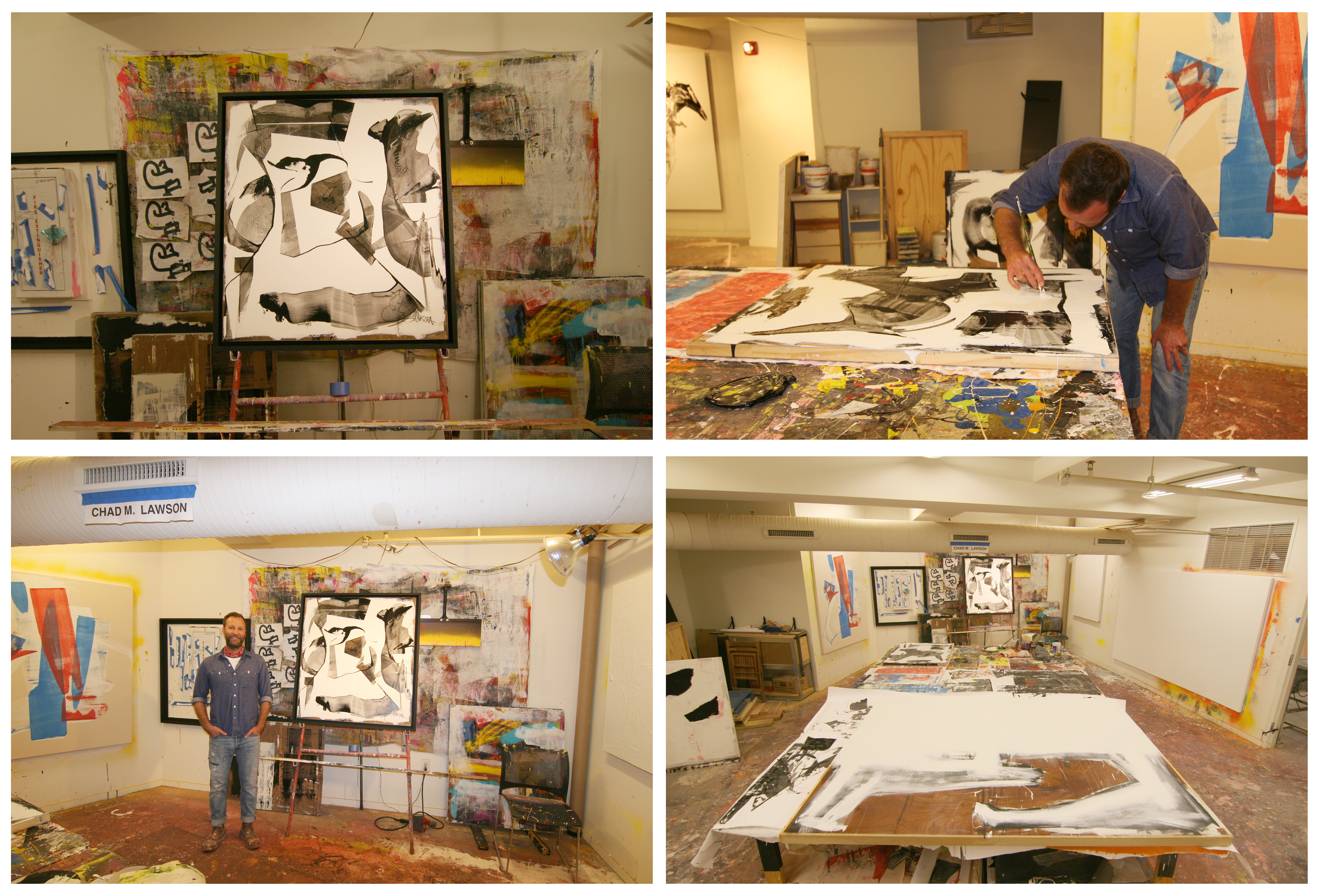
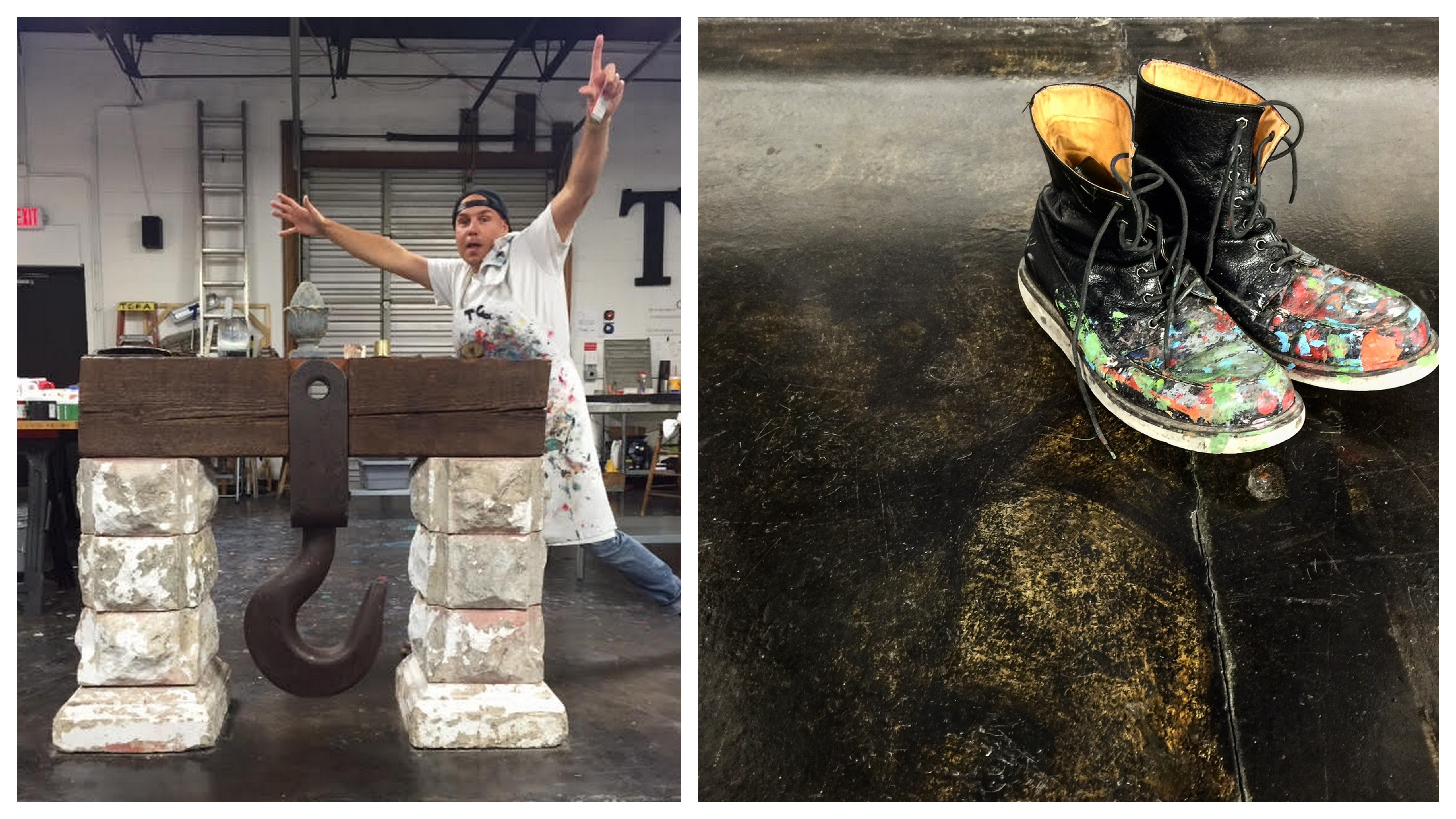
Photos from my studio visit with Chad!

Viewings by appointment only.

chadmlawson@gmail.com | www.chadmlawson.com | @chadmlawson

Sherwin Williams 2017 Color Forecast

Every year I look forward to Sherwin-Williams ColorMix, hosted in St. Louis, at KDR Designer Showroom. This event is the official unveiling of the projected color trends for the upcoming year. I was so inspired by the presentation I thought it would be fun to share the 4 palettes with you.

NOIR

It’s among our most precious commodities: night. We’re craving a refuge from urban streetlights and glowing screens, space to turn our gaze inward and recharge the spirit. Mindful melancholy is fueling a new romanticism marked by medieval patterns, revived customs and bittersweet beauty. The Dutch masters knew the secret: dark hues set a dramatic stage for sensuous luster. This palette is rich with vine-ripened fruits, Nordic blues, moody neutrals and golden yellows.

HOLISTIC

Sustainable design and radical transparency are the new standards. As our daily transactions move further into the cloud, acquiring experiences is becoming preferable to buying more things. “Doing good” is the new looking good, and it’s taking the form of “voluntourism,” healing retreats and eco-travel. We’re in pursuit of an elusive ideal: a fair luxury. The roads of this journey are lined with arctic neutrals, blush rose and wild browns.

INTREPID

The virtual and the real are blurring in the form of seamless commerce and “office anywhere” collaboration. Impatient for social and political change, we’re reinventing ourselves first. Identity has never been more fluid. “You do you” is the mantra of a generation primed for self-expression, cheered on by their own #squad and tossing aside old categories. There’s a feisty energy to our present moment, arriving in fiery tones and vibrant, kimono colors.

UNBOUNDED

Global immigration is redefining borderlands, national identity and our sense of coexistence. We’re all citizens of the world now. Brands are becoming more purpose-driven, communities more connected. Design is adapting to more diverse populations. Overconsumption is, well, over. We’re more likely to invest in the best we can afford — crafted and customized — and then keep it forever. Global consciousness is a mural painted in earthy mustards, ocean blues, corals and mud.

Visit Srote & Co on Pinterest to view our boards dedicated to each palette.

Choosing The Right Countertop

Selecting the correct countertop material is one of the most important decisions in your kitchen or bath project. With so many materials available today it can be overwhelming when it comes time to make this selection. In today’s post we explore some of the most commonly used materials and the expectations associated with them.

GRANITE

Granite is, by far, the most popular material specified in kitchen and bath remodels.  It is a strong, durable and long lasting material. Granite is scratch-resistant, and when sealed, impervious to stain, heat and water.  Slabs are available in a wide variety of colors and patterns. Granite requires sealing at the time of installation and over the life of the material, typically once a year.granite countertop close-up

QUARTZ

Quartz countertops are a man-made product consisting of almost 90% quartz, making it an extremely durable non-porous material perfect for kitchens and bathrooms.  It does not require sealing, will not chip or crack and is stain and bacteria resistant. Quartz is available in wide variety of colors and patterns. In general, it is more expensive and not as heat tolerant as granite. quartz kitchen counter

QUARTZITE

Quartzite is sandstone that has been subjected to heat and pressure due to tectonic compression. This resulting material is hard, dense and extremely resistant to abrasion and chemicals. Quartzite, like granite, does require sealing at the time of install and over the life of the material, typically once a year. This hard working material comes in a wide variety of colors and patterns and is idea for kitchens and bathrooms.quartzite counter

MARBLE

Marble is a relatively hard material composed mostly of calcite. It is highly resistant to heat, cracks and breakage, however, marble is very porous and susceptible to staining and etching.  Marble is best used in areas where it will not be exposed to chemicals, citric or acidic substances. Even with the use of a sealer, clean-ups should be handled immediately. If you are in the market for a kitchen countertop and want the look of marble I suggest looking at a quartz or quartzite product that will give you look of marble and the performance of a granite without the maintenance and upkeep.marble bath vanity top

WOOD COUNTERTOPS

Appearance is the number one reason people select wood for their countertops. It adds natural beauty and warmth to any kitchen and works well with several design styles. There is considerable maintenance required to keep your wood tops looking like new. Proper sealing is a must to ensure a non-porous surface and protect the tops from water damage. Wood is much softer than other materials typically used in a kitchen so scratches and dents are inevitable. Additionally, your wood top may require sanding and refinishing over it’s lifetime depending on use.

CONCRETE COUNTERTOPS

Concrete countertops offer a wide range or colors and finishes and are lightweight and durable. Concrete is naturally very heat resistant but also porous so a sealer is a must. The use of a sealer on your tops may cause discoloration if hot pans or pots are placed directly on the surface. Imperfections in the surface are a common occurrence due to the molding process and after time hairline fractures may occur. Concrete is gaining popularity in modern and rustic designs and works well in kitchens and bathrooms when properly maintained.modern kitchen with concrete countertop

STAINLESS STEEL

Stainless is already the go-to countertop material in most restaurants. And for good reason – they perform amazing! They are non-porous, resistant to water, heat, stains, mold, bacteria and other household germs. Additionally, you can place hot pots and pans directly on top them with no worries. However, stainless countertops will scratch and dent and tend to show smudge marks and fingerprints. If you can live with that they are suitable in any application.modern kitchen with stainless steel counters

The New Neutral

Over the past year or so, it seems like dark green interiors have been popping up left and right and the hue shows no signs of slowing down. It is one of the top design trends predicted for 2017. Think of it as the “new navy.”

This moody color works well with both traditional and modern decor. Working as a dramatic neutral it really pairs well with almost ANY color.  However, it truly shines when paired with other neutrals.  Add in beautiful wood tones, camel leather, natural linens and warm brass tones for a winning combination.

This is certainly a color you need to test out before making a final selection. As you should always do, purchase a few sample colors and paint large squares on each wall of the room. Live with it for a couple days and take note of how the color looks throughout the day. Different lighting conditions will greatly affect how the color reads in your home. For a more reserved take on the trend, paint a piece of furniture or add a pop of the color using a piece of art or pillow!

So what is your take on this color? Love it? Hate it? Sound off in the comments!

Srote & Co Architects | Latest Completed Projects!

I can’t believe summer is already coming to a close! We have been quite busy here at Srote & Co Architects | Planners | Interiors! We have so many exciting new projects in various phases of design. While planning, drawings, sample ordering, pricing, etc. are all important steps in the home building/renovation process, nothing is more exciting than seeing the final product! Seeing your vision and plans come to fruition is a magical feeling!

Here’s a peek at a few projects we have completed this year.

SACKSTON PRAIRIE

This custom home architecture was planned and built based on a modern prairie style home design concept. I love the exterior of this home with its strong horizontal lines complimented by natural stone and stucco. Inside, the floor plan is open and the decor is cool and contemporary!

LAUREL FARMHOUSE

The essence of cool. This modern farmhouse design is clean and classic, yet modern and fun! Check out the floating staircase, beautiful planked fireplace and vaulted ceiling.

SUNSET HILLS OUTDOOR ADDITION

I’m sure this custom home addition design is getting lots of use this summer! It includes an extended garage with a large grotto located directly beneath it. Equipped with a bar, dining and lounge area, bathroom and changing room, this grotto has everything you need for a summer gathering.

TWIN FAWN CUSTOM

This custom design spec home is currently FOR SALE!  It is situated on a 1 acre level lot and offers over 5,000 sq ft of living space. It was completed with neutral finishes with textural interest to create a relaxing interior and serve as the perfect backdrop for future home owners.

We have quite a bit more in the works so stay tuned for another update in the future! Or check out our architecture and interior design portfolio.

A Well Lit Interior

Lighting is one of the most important considerations in your home. It sets the scene for experiences and emotional responses. When done incorrectly it can lead to eye-strain, fatigue, headaches and stress. When done correctly it can facilitate daily tasks, highlight architectural features in your home, expand spaces or create an intimate environment. There are 3 main types of lighting that should be considered in every environment – Ambient, Task and Accent. Lets break down these layers and show you some of our favorite examples of how to accomplish them in your home.

GENERALLY SPEAKING

Ambient Lighting is commonly referred to as general lighting. As the base layer of lighting it provides a blanket of overall illumination in a space, and is essential to any lighting plan. Its main function is to provide adequate lighting for visibility and safety to navigate throughout an area. In some cases it serves as the only light source, such as a laundry room or closet. Examples include recessed and track lighting, wall sconces and chandeliers.living room and breakfast room inteirors

THE TASK AT HAND

Task Lighting is a smaller, more concentrated light used to illuminate specific areas where a more intensive and directed light source is required. Island pendants, undercabinet lighting and a well placed desk lamp are the most common applications of task lighting. LED lighting on stairs

ACCENTUATE THE POSITIVES

Accent Lighting is used to highlight a specific object. It evokes feelings of meaning, creates drama and conveys importance of the object it illuminates. Most commonly it washes light over artwork and sculptures, bookcase displays and highlights architectural features in a home.paneled library with accent lighting

Hopefully this will shed some light on one of the most commonly overlooked aspect of interiors. We would love to see how you have incorporated lighting in your own spaces. Feel free to share!

Get It Together!

It’s already August, which means “back to school” is right around the corner! Getting in a new routine and organizing our daily lives can be a struggle. Here are a few tips that can help simplify the day-to-day.

Productivity Apps

apps copy

Wunderlist is an app that stores all types of to-do lists. I love that it allows you to share your lists and work collaboratively with friends and family (i.e. my husband and I share a grocery list, when he buys an item and checks it off the list, I am notified). It has also been a great way to help us organize our kitchen renovation project. I love hearing the satisfying chime as I check off a task.

Google Calendars is a great way to stay organized. Because I enjoy hand writing everything I used to keep a physical planner. However, I recently converted to Google Calendars and I will never look back. In addition to notifying you of upcoming events and estimating the drive time based on current traffic conditions, it also allows you to invite and send the event to others.

Cozi is an app geared toward organization for the whole family, including chores, groceries, upcoming events, etc. Its features allow multiple family members to manage appointments and schedules with one account, as well as organize and update shopping and to-do lists.

Create a Drop Zone

Whether you enter your house through a mudroom, laundry room, back entry, foyer or straight into the kitchen, it’s imperative to have a “drop zone” to corral the clutter. A designated place for shoes, coats, backpacks, mail and keys will keep your belongings organized and looking good.

Control Paper Piles

Establish a system to deal with mail and the piles of paper your kids will surely come home with on a daily basis! I really liked how Young House Love handles their paperwork. They keep a basket in their office and put the papers from their child’s backpack into it daily.  Every two-weeks, or once it is full, they go through the papers and decide what to file, what to display on their bulletin board, and what to toss.

iHeart Organizing is another great source for ANYTHING & EVERYTHING dealing with organization. To organize her children’s school work, she keeps a file box for each kid with folders for K-12.  She attaches their school pictures to the front of each folder and is very selective about what she saves. Read more here!

Do you have any tips for staying organized?  Any apps that you have found successful?  We would love to hear your ideas!

Florida Room Challenge with Douglas Elliman

Have you been craving a way to infuse summer into your home year-round?  Adding in some key beachy elements can keep your home feeling bright and cheery even throughout the cold winter months.  We were recently contacted by Douglas Elliman, global real estate firm, to get our take on Florida style.  Here are our tips on how to infuse a touch of Florida in your home!

Lighten up the Walls and Floors

bright white and airy dining room
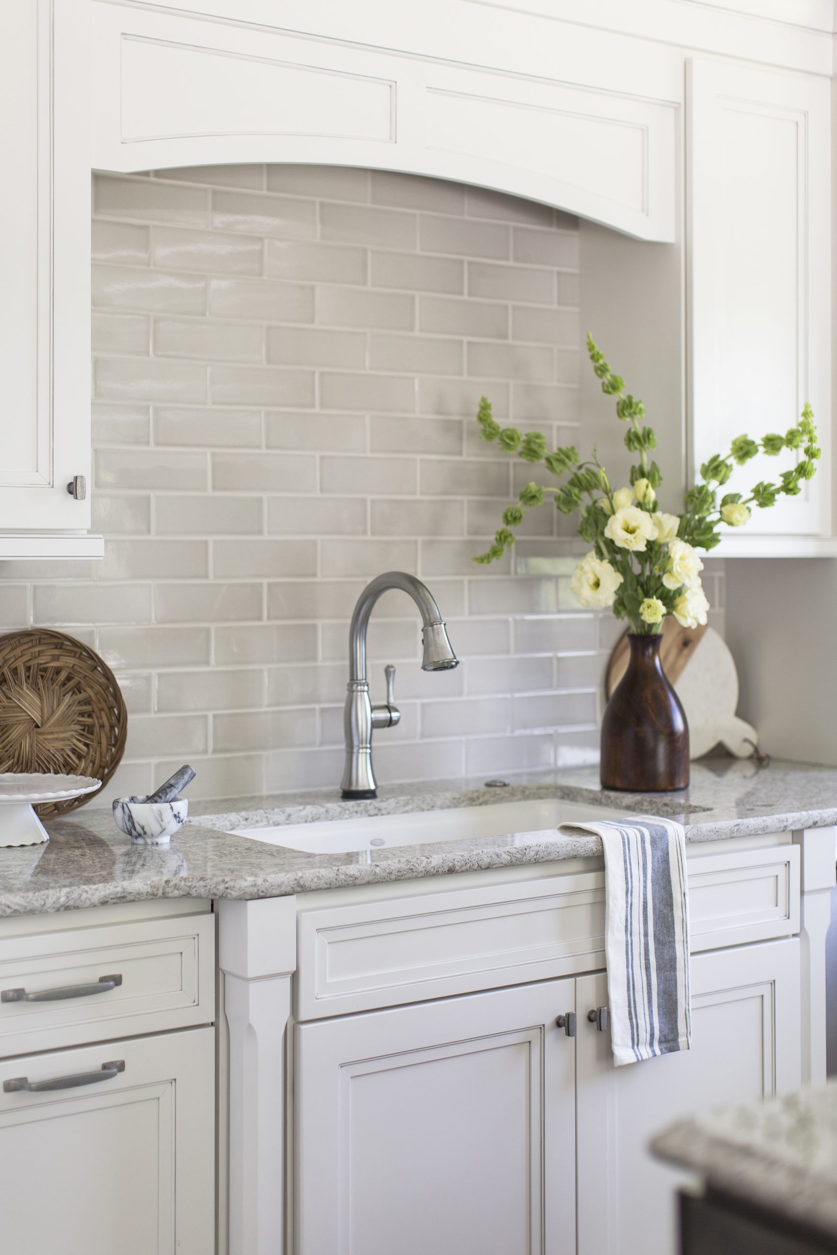
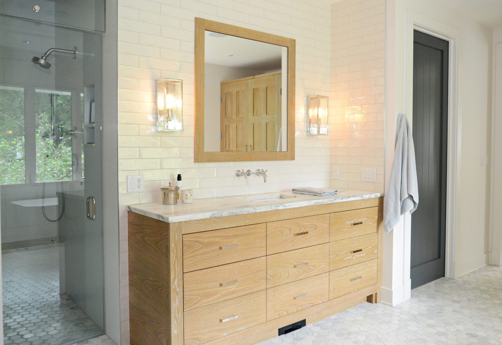
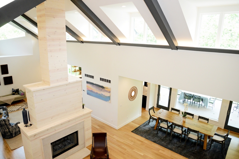
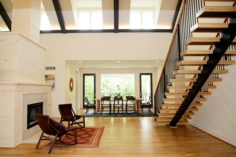
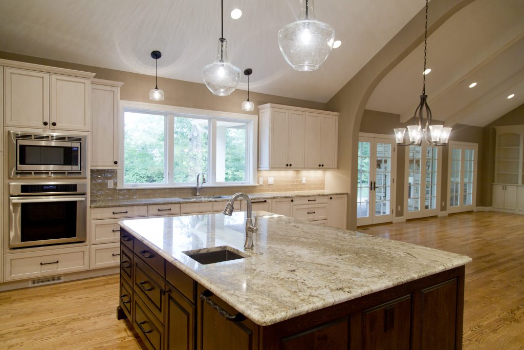
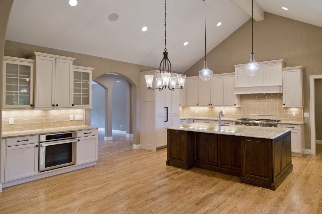
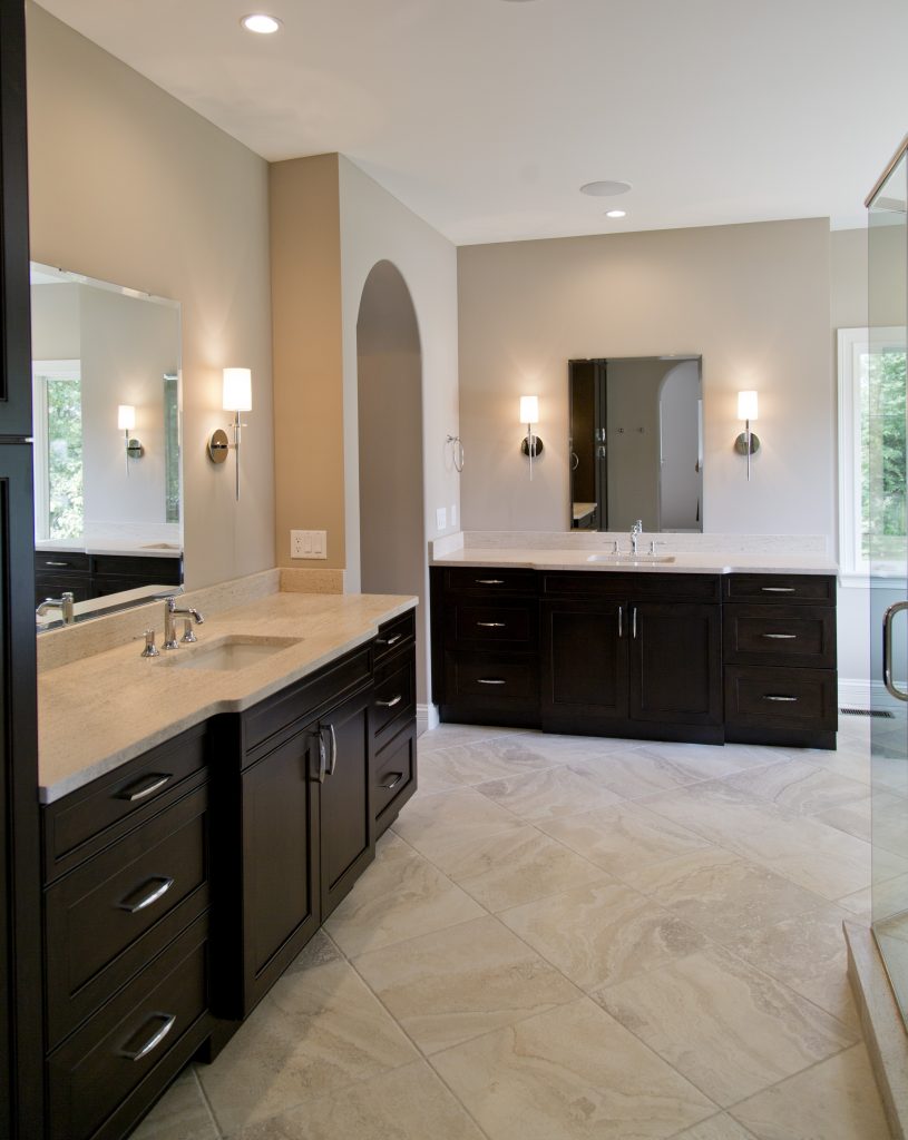
White and light walls make a space feel fresh and crisp.  Benjamin Moore Decorator’s White, Chantilly Lace and Simply White are some of our go-to paints to consider.  Adding a plank treatment to the walls is a great way to add interest and texture while maintaining a neutral base.  Flooring and large furniture pieces are also best when lighter in color.

Add Natural Elements

driftwood element
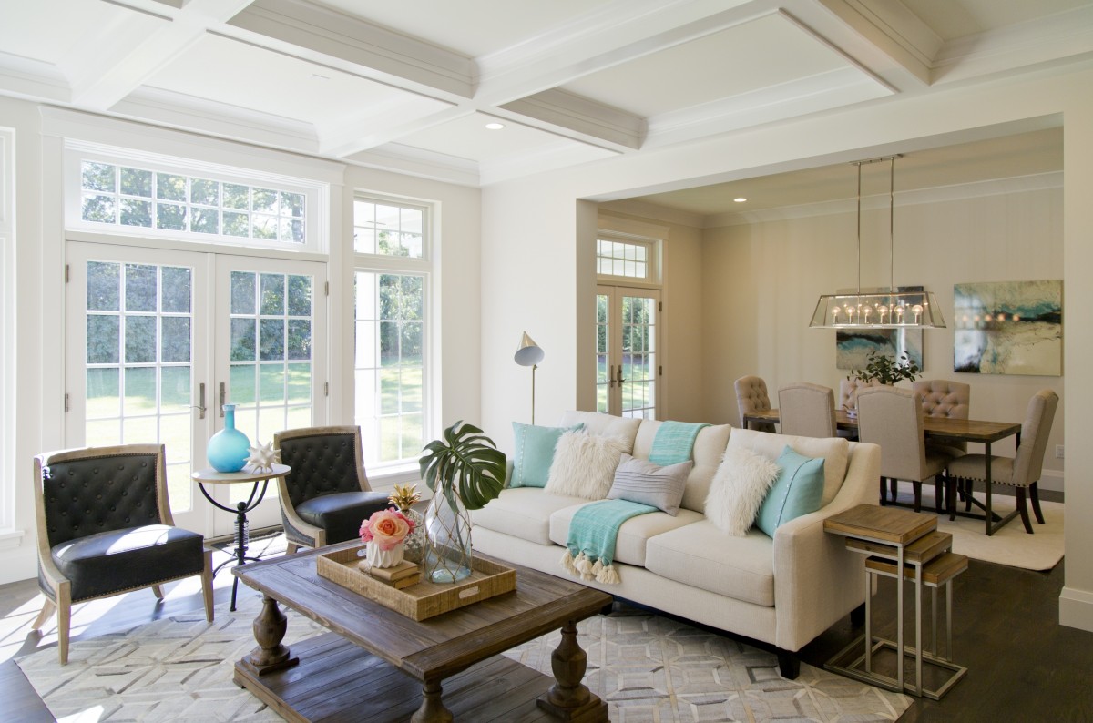
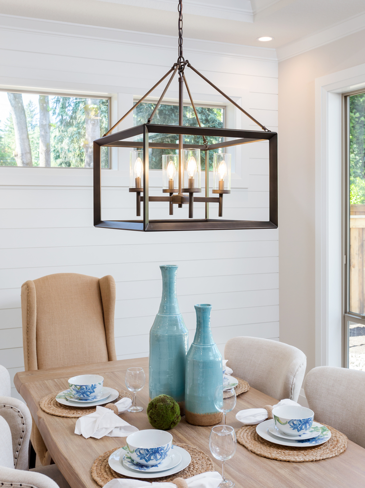
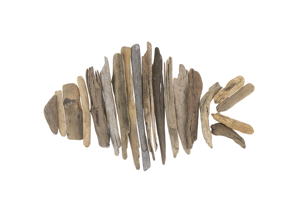
Ground your space with a sisal rug.  This natural textile will provide warmth, texture and durability to your space.  Other elements such as a driftwood sculpture, rattan chair, or natural wood dresser will remind you of the beach and provide the layered look you’re after.

Infuse Color and Bold Accents

bright and vibrant artwork
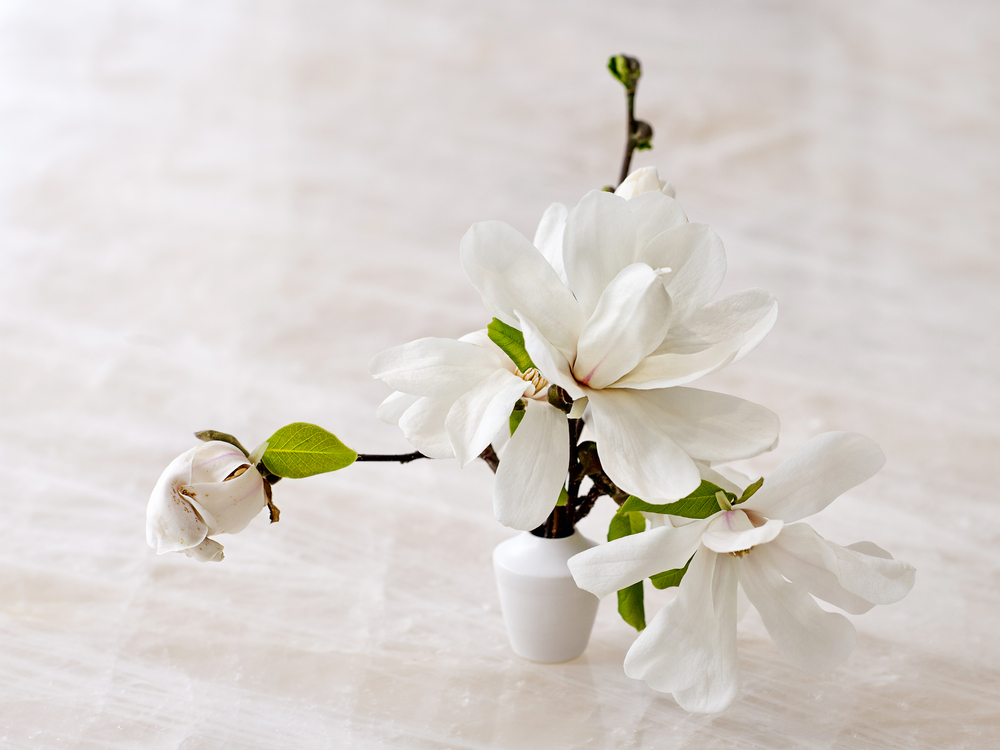
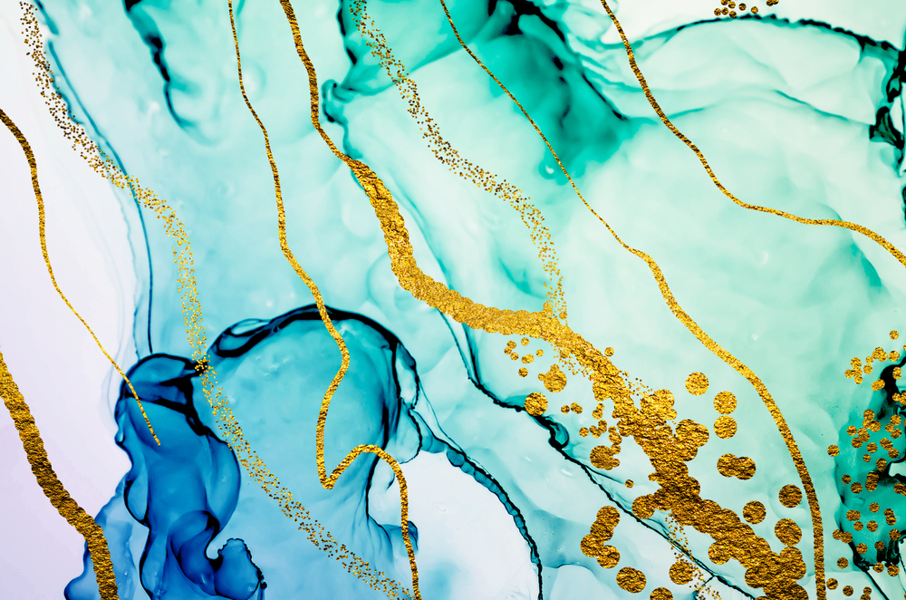
Have fun with sea-inspired artwork and decor.  Blue is an obvious reference to the sea and sky and can be found in most Florida inspired rooms.  Displaying a collection of sea glass, a fun piece of art that pops, or a pillow with an organic pattern will all help to enhance your space with color.  Lighting is another great way to have fun with the theme, whether it be a coral shaped chandelier or capiz shell fixture, it will certainly make a statement. We love this print featured above for the color and reference to water!

Exercise your Green Thumb

tropical leaves in clear vasePlants are so important to design.  Not only do they bring a touch of nature indoors, but they also better the air quality of your home.  Adding plants to every room will infuse so much color and softness into your home.  In last week’s post we professed our love for tropical plants, so we suggest trying a potted banana leaf plant or a simple palm leaf in a colorful vase.

Trend Watch – Welcome To The Jungle

banana leaf print
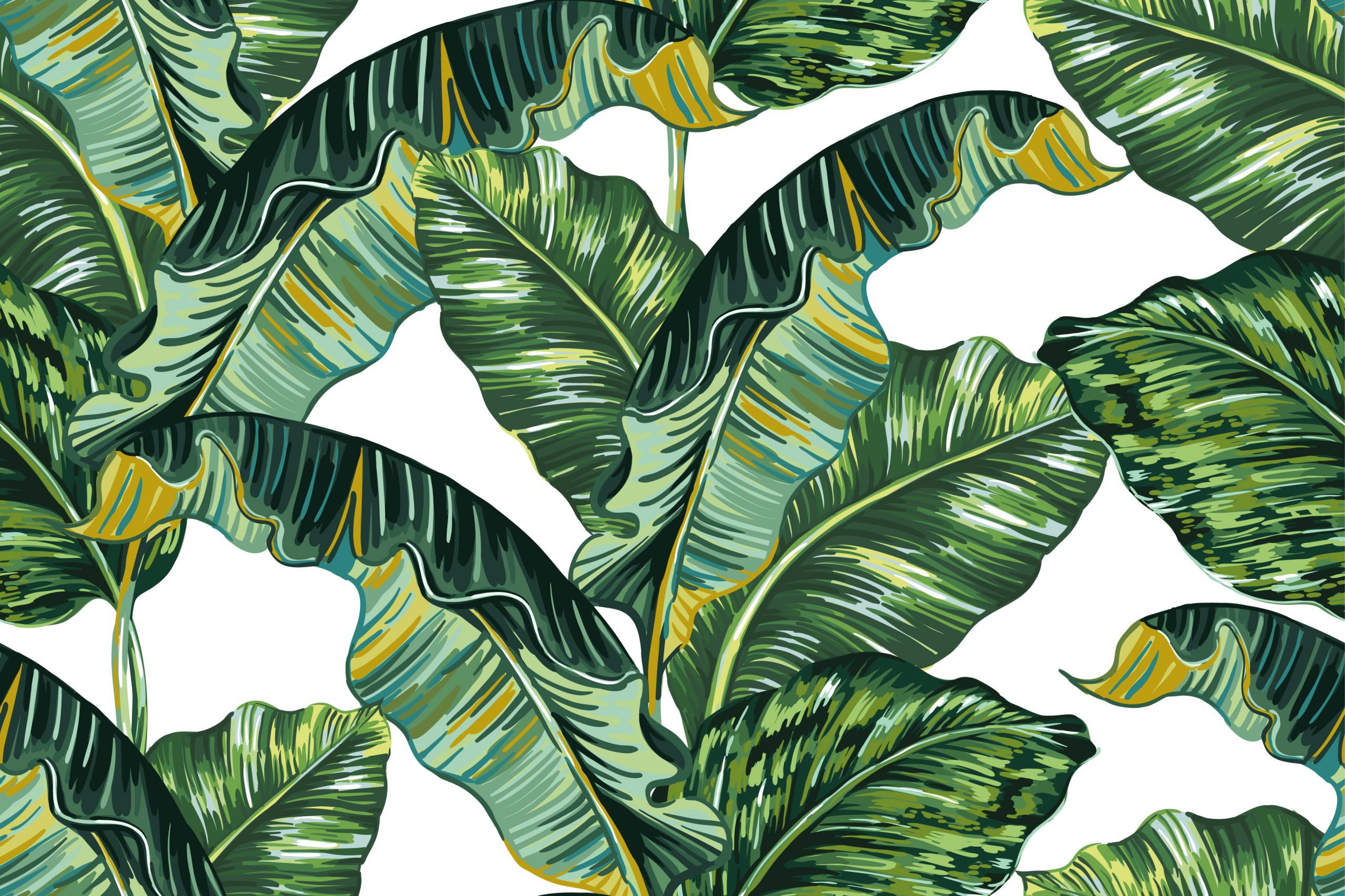
I don’t know about you but I am currently loving the resurgence of this tropical trend in decor and accessories. And its a good thing because I can’t open a magazine or my Instagram feed without being overwhelmed with designs or accessories embracing this element.

DON’T CALL IT A COMEBACK

The banana leaf was made popular in the 1940’s when decorator Don Loper designed and installed over 5 1/2 miles of the now iconic, Martinique wallpaper, in the Coffee Room and the hallways at The Beverly Hills Hotel. At the same time Dorothy Draper was beginning a major renovation at The Greenbrier Hotel in West Virginia giving us the iconic Brazilliance wallpaper. Truly standing the test of time, the wallpapers remain in both hotels today.

FASHION & DECOR COLLIDE

While there used to be an almost 5 to 6 year lag from the runway to interior showrooms we now see an immediate correlation between the two. This is due mostly to the popularity of blogging, social media and communication between the creative minds in each respective field. Today you can find banana leaves on everything from iPhone cases to swimwear.

What are your thoughts on this tropical inspired trend? We would love to see how you are embracing this in your everyday life!

Saint Louis Artist – Ted Collier, Ted Collier Fine Art

ted collier

GET FAMILIAR

If you don’t know who Ted Collier is, you really should.  Best known for his abstract acrylic paintings on canvas and signature circles he refuses to be defined by one style or medium.  An avid outdoorsman and fisherman, he is inspired by the patterns he observes in nature as well as the space his art will occupy.  Ted is an artist in every sense of the word. His passion and intensity are infectious and he happens to be a super cool guy!

ARTIST EVOLUTION

A lot has changed for Ted Collier in the past 5 years. The story goes something like this- boy meets girl, girl encourages boy to pursue his life long passion, boy listens to girl (good boy) and leaves his career in commercial real estate, boy and girl get married, open a restaurant (Katie’s Pizza & Pasta in Rock Hill), and boy achieves international success.

GRATITUDE, DRIVE AND FOCUS

Ted Collier is proof that with enough hard work and determination your dreams can be achieved. His new 2,500 square foot studio/gallery space in Creve Coeur is a far cry from the corner in the auto repair shop he was painting in just a few years ago. Today his art is featured in countless private collections in Saint Louis, Switzerland and Australia to name a few. Ted is also experiencing commercial success. Most recently he was commissioned by Nordstrom to create 18 pieces for their Los Angeles Flagship Store and Vancouver, BC stores. He is truly humbled by all the support and encouragement he receives. Lucky for us that only fuels his artistic fire. The sky is the limit for this Saint Louis artist and I personally can not wait to see what his future holds. #stlproud

Ted Collier Fine Art is located in Creve Coeur, Missouri. Viewing is by appointment only. Prepare to be inspired!

Ted Collier Fine Art | Saint Louis, MO 63132 | 314.803.7727

www.tedcollierart.com

UNINTENTIONAL ART

I recently visited Ted’s studio and while we were viewing and discussing the available pieces I couldn’t help but notice the paint splatter on his black boots. I joked with him that the splatter on his boots even looks like a piece of art. When I told him I was going to mention them in the blog he sent me a photo. Guess what? Even the photo he sent me of the paint splattered black boots looks like a piece of art!!!

collage 1

Ted Collier in action | aforementioned boots